|
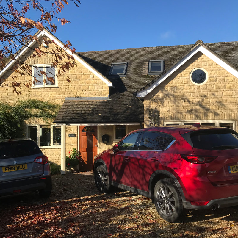
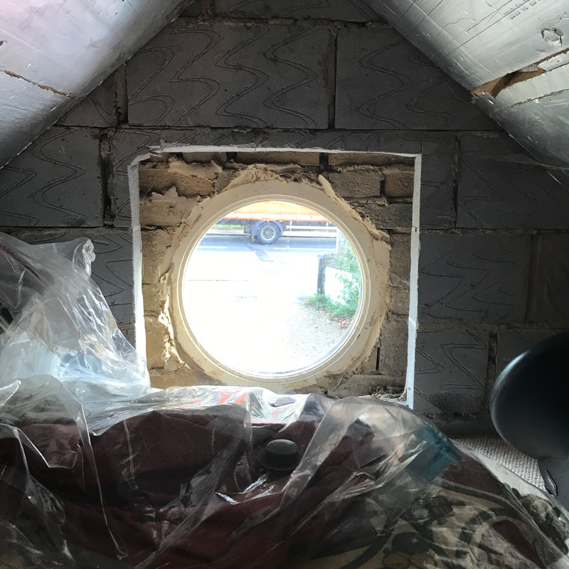
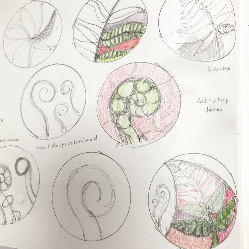
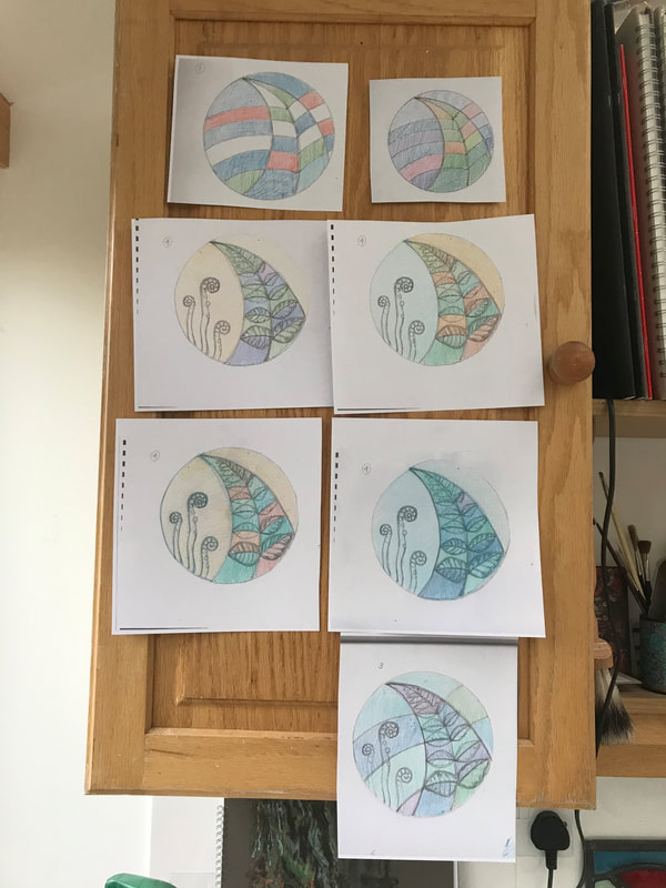
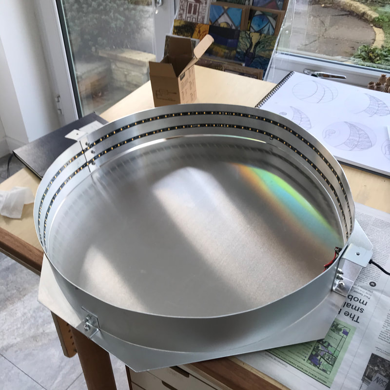
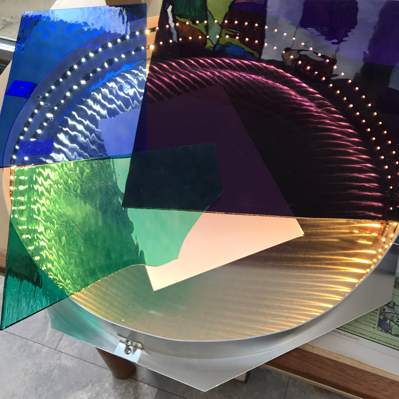
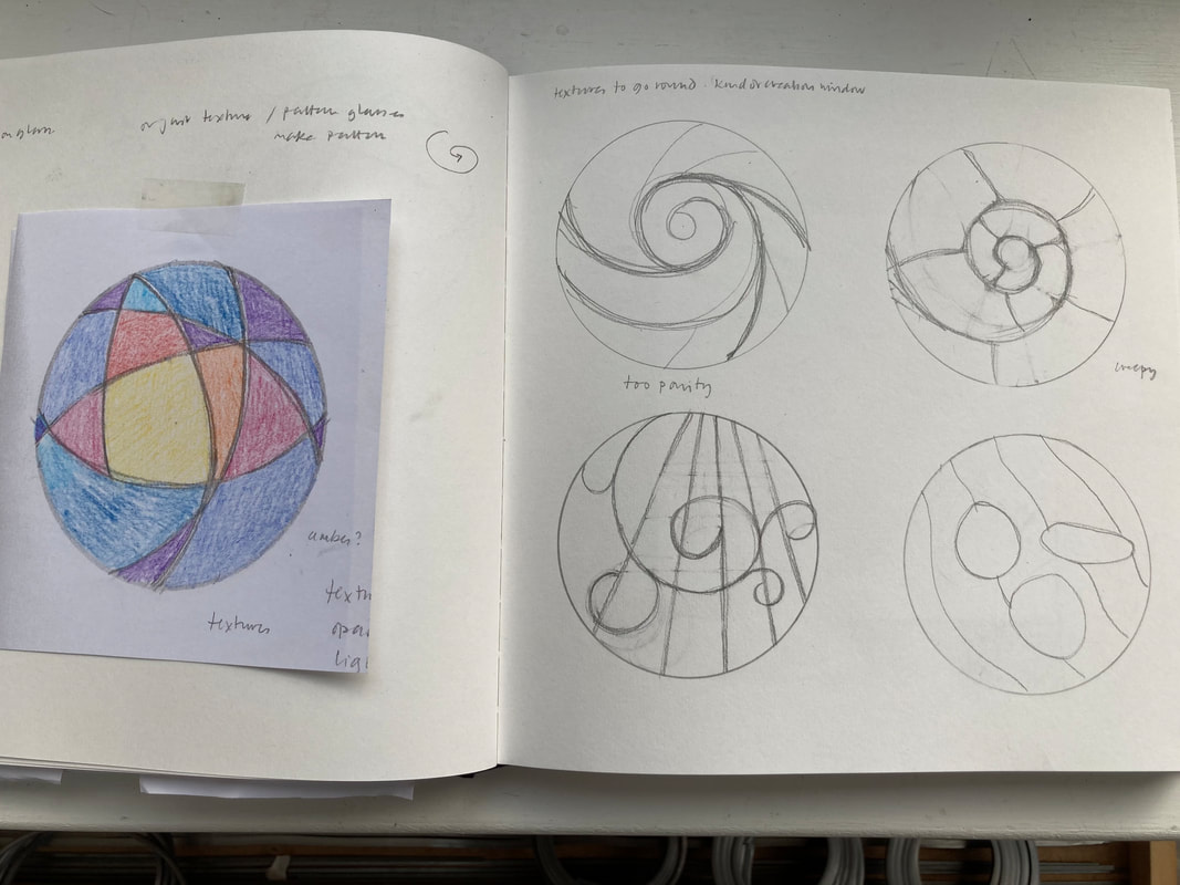
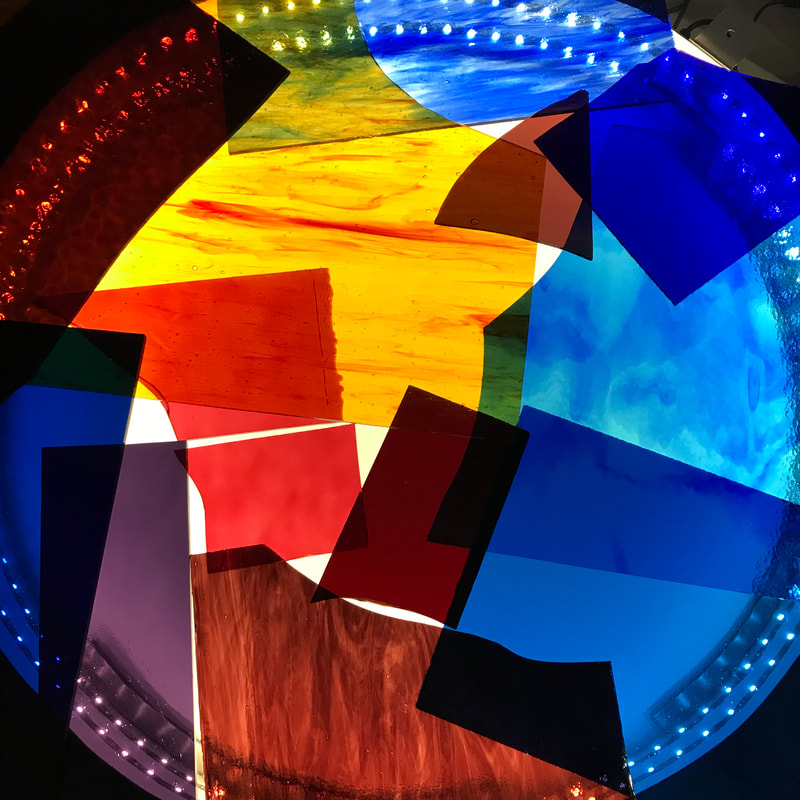
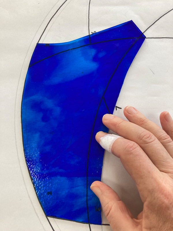
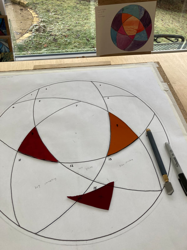
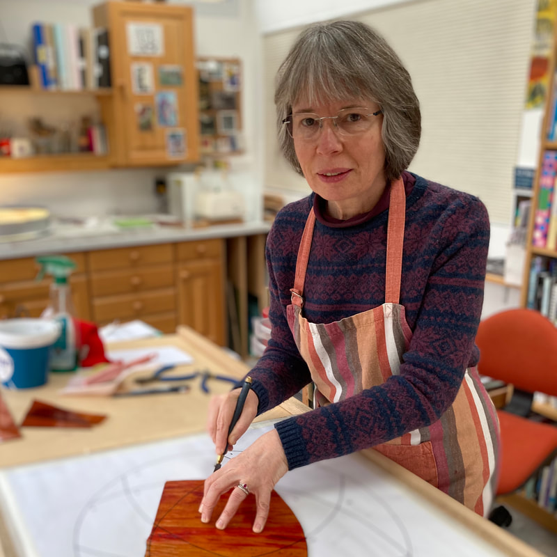
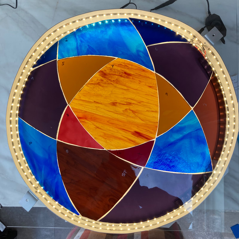
When Lockdown 1 ended and life opened up again (for a while) I was approached with an interesting proposition - creating a circular stained glass window, which can only be seen from the front of the outside. The client, Teresa, explained that she wanted something lovely to look at when she arrived home. The window sits in a gable which was once over the front entrance of the house when it was a bungalow. Nowadays the space within is just a low storage area off a bathroom. Normally, of course, stained glass is viewed from the inside. I suggested that we would need to back light the window and I showed them a mock up involving a cake tin and some LED ribbon. As it turns out, Teresa's husband Richard is an engineer and he volunteered to create a circular lightbox - subsequently dubbed 'The Biscuit Tin'. Teresa's initial suggestion for a design was plants, as she loves her garden, with the colour red to feature. I knew I needed to create something bold enough to be 'read' at a distance, and I wanted to use the circle in a dynamic way. I started with design ideas based on ferns, but when we met again to look at the designs and the splendid metal Biscuit Box, with its rings of LEDs, we agreed we needed to adjust our ideas.The effect was a bit startling. As soon as we put glass onto the light box it became apparent that an abstract design was going to work better - and I could see that with that amount of light I would be able to use gorgeous, deep colours. So I went back to the drawing board and developed more designs. It struck me, as it has done before, that I can make designs which are quite effective, but not necessarily attractive, such as the top right hand design above which is based on the curl of a new fern leaf. It is slightly creepy! However, the basic vortex idea was firmly embedded in my mind. I knew I wanted rich colours and textures and I gathered up a palette of glass, and worked out the colours, using both paint and pieces of glass on the lightbox. What the design signifies to me is the light coming out of the darkness, whether it is the initial act of creation ("Let There be Light!), or the light at the end of the dark tunnel we find ourselves in now. Happily Teresa and Richard are happy to 'go abstract' and Teresa likes the sense of the sun at the centre. Given that she and I met in a yoga class, the piece could equally be called 'Salute to the Sun'! In selecting the glass I have tried to achieve a balance of textured, wispy glass and plain pieces to provide contrast, and to make the fiery orange the centrepiece. Luckily I had stocked up on my favourites at Reading Stained Glass in February, including a beautiful piece of wispy blue and turquoise Bulls Eye glass . You can see me cutting it above. (The plaster on the finger is a badge of honour in this job.) The other star piece of glass is the wispy orange and red for the centre. Cutting it was nerve-wracking as it was my very last piece. Happily, Teresa and Richard are happy to 'go abstract' and Teresa likes the sense of the sun at the centre. After a final check of the measurements of the window recess by Richard, I could make the cutline drawing and get cutting. Here it is on the Biscuit Tin. Now for the leading... I'll have to ask my husband to make a bespoke jig to hold the work on the board. Luckily, he has developed a taste for woodwork.
0 Comments
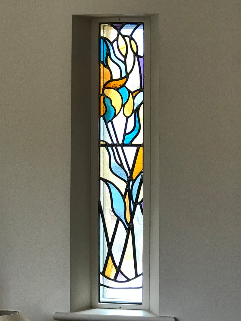
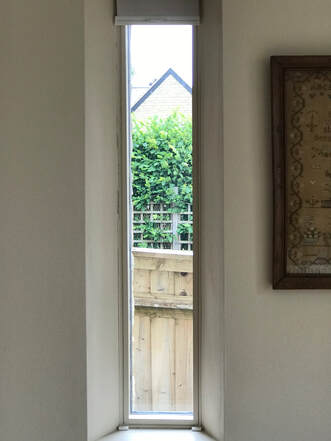
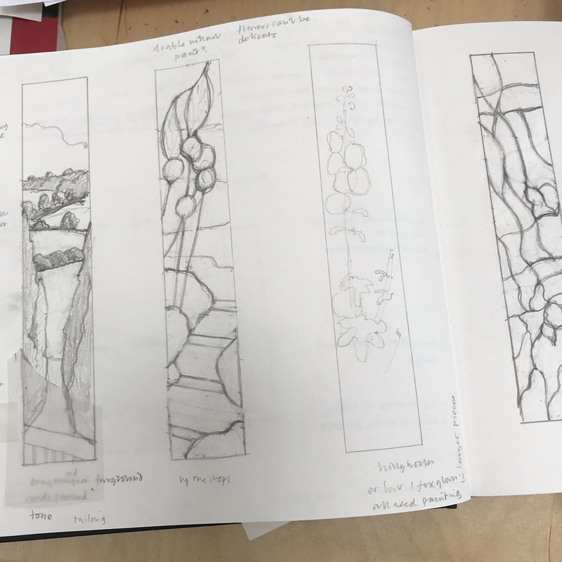
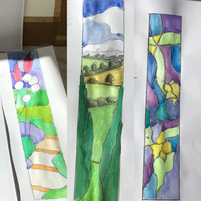
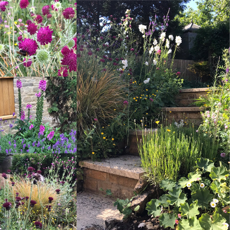
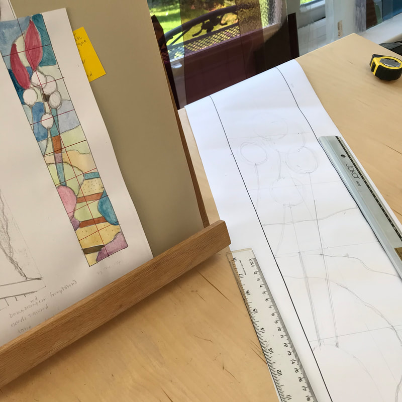
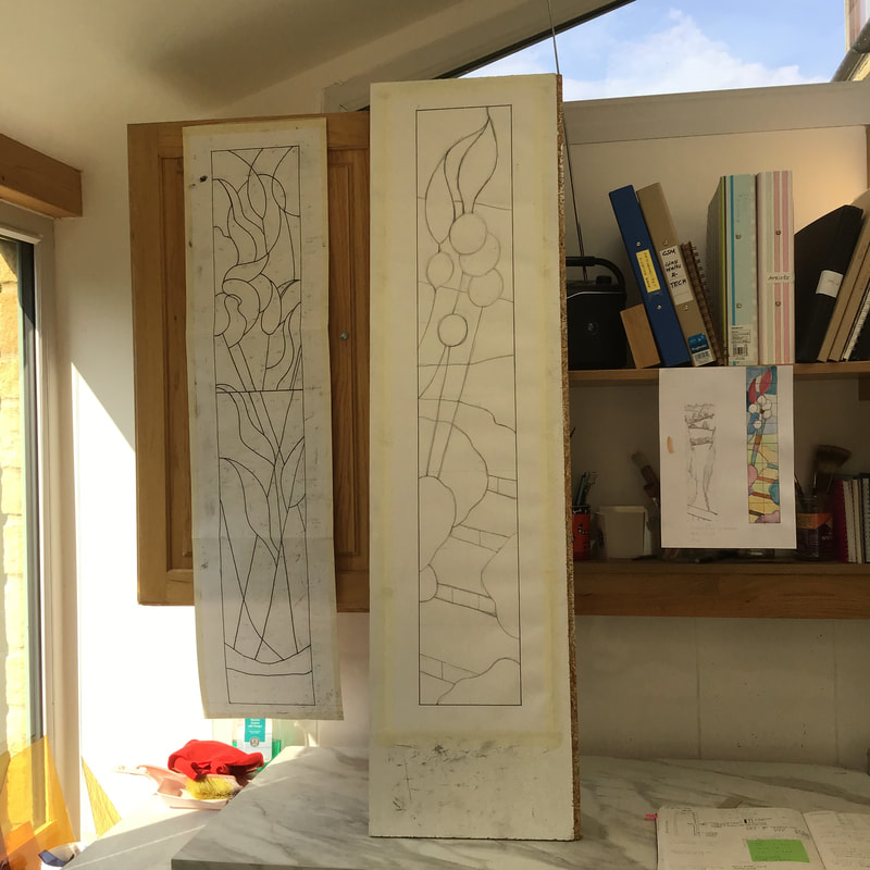
As lockdown was lifted I was delighted to be asked to design and make a second arrow-slit window as a companion to 'Vase of Lilies' I made for a house in Charlbury last year (see my blog of of June 2019). The clients wanted a window with a family resemblance, and this created an interesting design challenge for me - not only the extreme narrow form again, but how to make something similar, but different. It is on the opposite side of the sitting room, with morning rather than evening light and again it would mask a not very inspiring side view of fences etc. (The room also has very attractive views over fields, trees and distant hills). Should I design more flowers in a vase, but with a different colour scheme? Perhaps spring flowers in the morning window, as a companion to more autumnal colours in the first? Or use the same colours, with a contrasting design? I knew the clients were not keen on me using paint on the glass, so the design was all about the colour/texture and the lines of the leads. I was keen to reuse the method I use before of taking a narrow slice of a wider picture, which creates more impact and a degree of abstraction. Three different designs emerged: a garden scene, a deep view from the rear of the house and finally, a more abstract design based on reflections. For this one I returned to photographs I took several years ago of daffodils reflected in my parents' pond. The design based on the garden steps going up through the border was my favourite for this project and I was very pleased that that was the clients' choice. It was based on a lot of drawing and photography over the summer - and a deep sense of gratitude to have a lovely garden to nurture and enjoy during this difficult year. Given that I had to keep visits to the clients' house to a minimum, it was helpful that their garden also contains step, slopes and tall flowers. When resolving the design, I kept looking back at the cutline for the 'Lilies' window to make sure they would complement each other. Somewhere in my mind was Charles Rennie Mackintosh, the Scottish designer at the turn of the twentieth century - I will never forget my visit to the Glasgow School of Art and the famous Willow Tea Rooms. Many colour studies later, work began, as you can see in the slideshow below. Now the cement is curing, and I am looking forward to the installation. I do hope the sibling windows get on well together.
The light has changed - the garden has changed and the hot pinks of summer are giving way to faded dustiness and the deeper reds of Autumn. I particularly love the combinations of faded echinaceas and sedum. Even the foliage of the humble loosestrife is turning a lovely dusty pink and salvia 'Hot Lips' has turned from its scarlet ways to the prettiest pink.
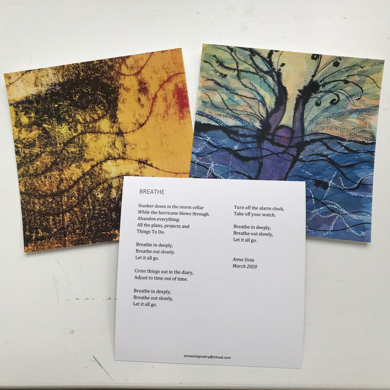
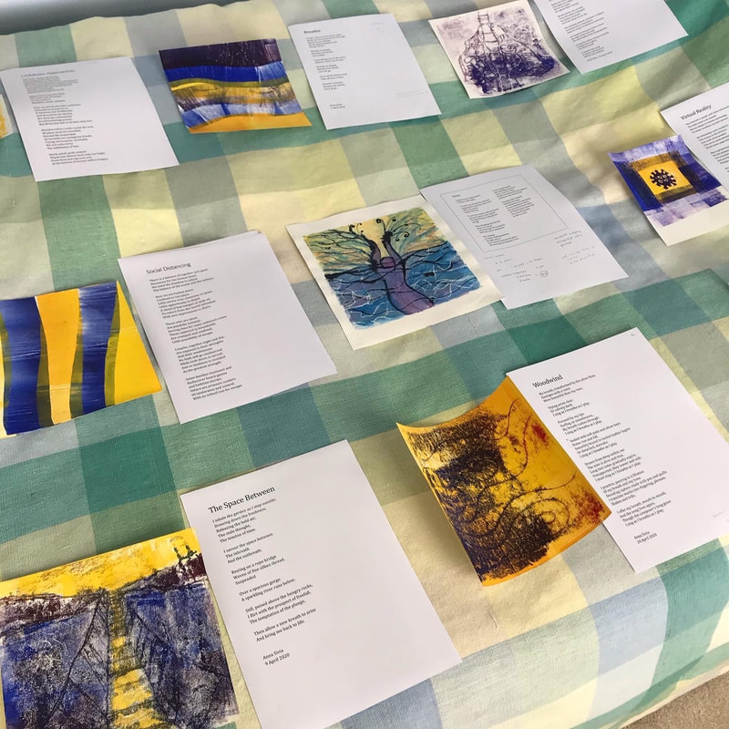
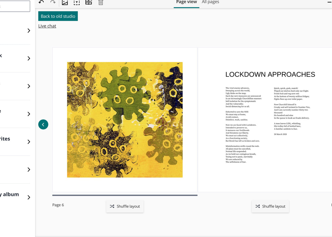
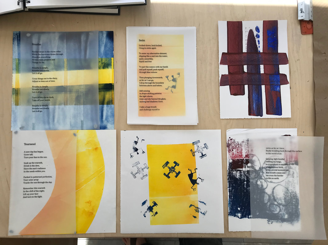
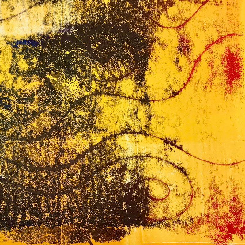
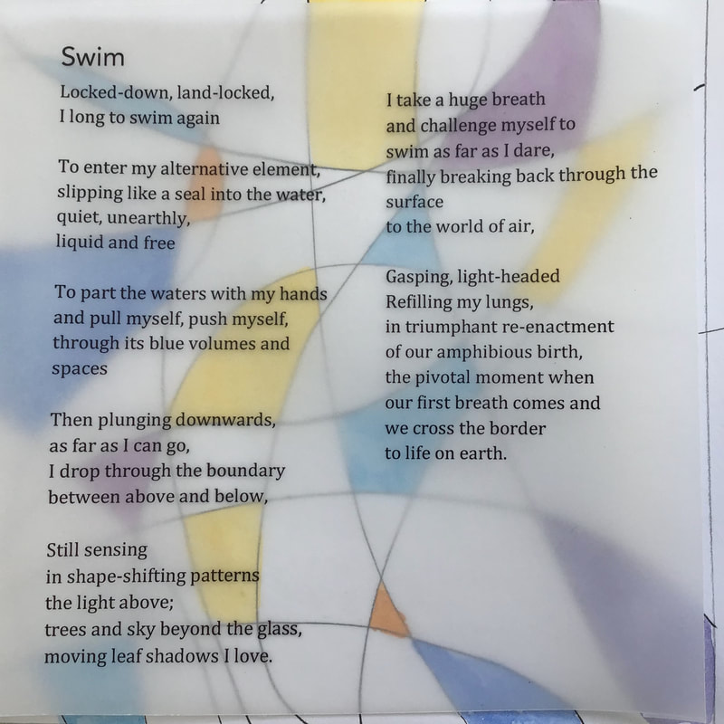
I will store up these colours and return to them one cold day when I can play with my new, and lovely, Schminke 'professional' watercolours. The proof postcards of three of the images for my "Breathe' book now have arrived, and they are good - as large postcards - but not quite what I had envisaged as the elements of a potential artist's book. They seem not large enough, and a bit flimsy. And so I have decided to use a photo printing company (Photobox) to create my book, using the format of a hardback album. My objective was to use their format creatively, and bend it to my needs! Having moved on from my previous imaginings of over laying each image with a text printed on translucent paper, I decided to create double page spreads of image and text. I spread the whole thing out on the bed, to see how it was all going to work as a whole, both visually and in terms of the content of the poems, and then I set to work. Using the text input provided by Photobox soon proved to be too fiddly for my purposes, so I have set out each poem text in Canva and then imported it into the book, as if it were an image, to go alongside my scanned artwork. I am very pleased with how it looks in preview mode and have enlisted various family members to proof read for me. I have now pressed 'send' and await the first batch, for people who already expressed interest. I am very grateful for their support, as it gives me confidence to keep going. 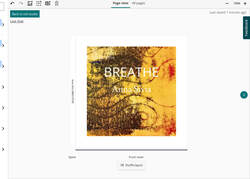 Now I have to wait until delivery at the end of next week! I find you can never tell how something is working until you have it physically in your hands... The book will be priced at £40, or £45 with a box. Please contact me if you would like a copy. Since I completed stained glass for my Artweeks exhibition and made videos for what it became - the virtual Artweeks festival - I have not made any glass. Instead, unexpectedly, I have been writing poetry, which is something I have only attempted very occasionally before. I have have been enjoying it enormously and have become very absorbed. A sequence of poems has emerged, on the theme of 'Breath'. These mix thoughts arising from yoga breathing exercises with observations of the current pandemic situation. I have been sending them to friends as a gift during this strange and sometimes frightening time. Although it is strange and sometimes frightening, lockdown has offered many of us time. In May I began experimenting with ways of making images to accompany the poems. I didn't want to illustrate them literally, but rather to find some visual equivalents for what I was trying to express. I decided I could use any art material I had in the studio. I began with my lino-print rollers and inks, using them directly. I printed the poem texts on tracing paper, thinking of overlaying them. I also tried trying mono print drawings, such as the one below, an idea for 'Woodwind' - the sound of the breath emerging from a flute. I laid the paper on the inked tray and drew onto the reverse. The results are unpredictable, but turning the paper over is always a discovery. Simultaneously I experimented with watercolour, ink and wax resist. I did about a dozen versions of 'Swim' - here are two different very approaches, below: These idea also went off sideways into a designs for glass, to be kept for another day. I would like to create an artists book, with the texts printed on translucent paper, interleaved with the printed art work. I intended to get it printed and then bind it myself. I investigated the practicality and cost of having small run printed. But after a very helpful conversation with Mark at KSM Litho in Chipping Norton, and a look at the eye-watering estimates for small runs, sadly I had to rethink. The cost of printing what I had in mind was far too great, not knowing if there would be any interest at all.
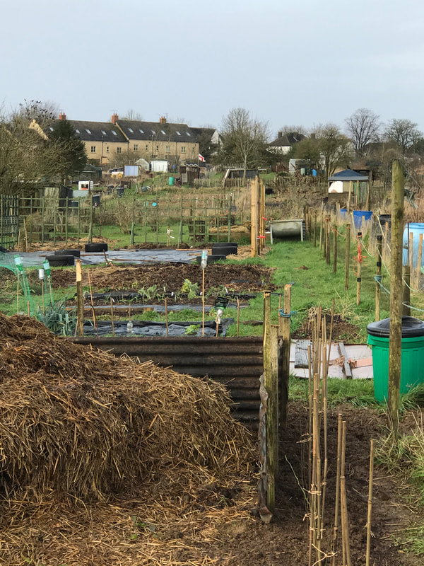
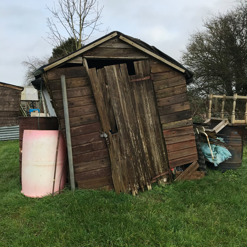
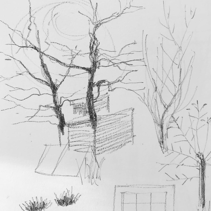
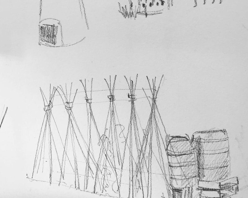
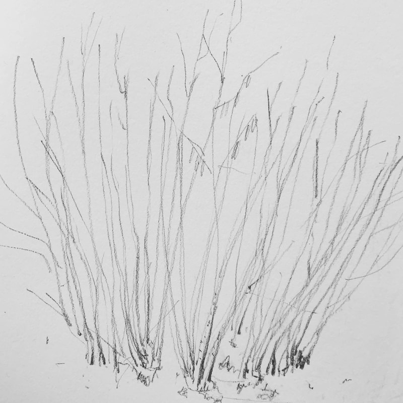
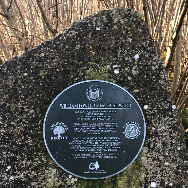
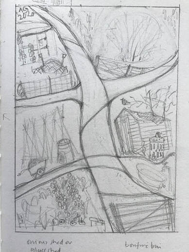
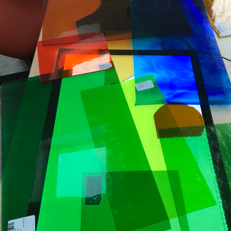
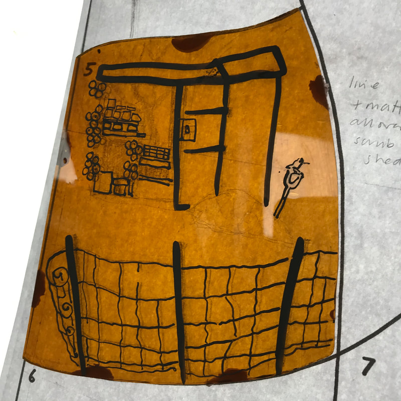
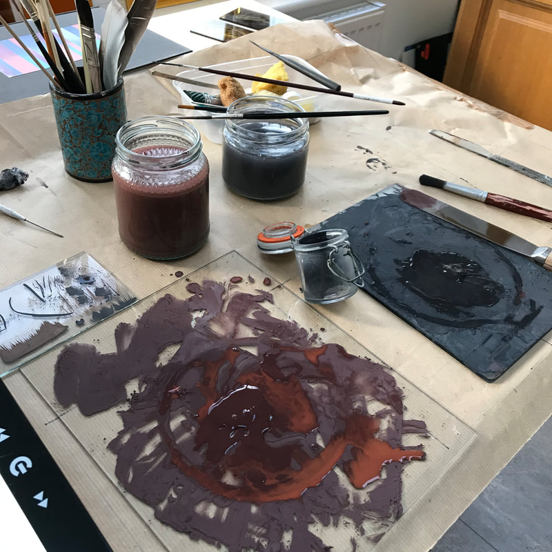
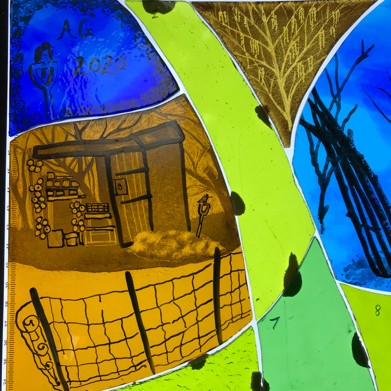
So I am thinking laterally and using Sixprint, my online art art card printer, to print the images as large square postcards, with the texts on the reverse. I can then enclose them, as a set, in a handmade cover of some kind, the design of which is still brewing in my imagination. It has to be translucent! I am impatiently awaiting the proof cards. If successful, the 'Breath' collection will be available for sale on my website and at my exhibition in the Charlbury Deli in Sept, along with the best of the original artwork. I am very interested to know what people think. This year I have been drawn into a project concerning some historic allotments at the edge of Chipping Norton, off Glyme Lane. They are currently threatened by large-scale housing development and by a planned relief road cutting through this area of farmland and ancient tracks. Last year artists Judith Yarrow and Crabby Taylor began meeting there to record and find inspiration by drawing and painting directly from what they found. An exhibition is planned to raise awareness of the value of the allotments and the adjoining Millennium Wood. The group has now been expanded, so that the show will include a poem, drawings, paintings, mixed media, ceramics, artists books, my glass and sound recordings of interviews with allotment holders. Personally, I am finding it stimulating to work within such a varied group and to be involved in a project with local and wider significance. Getting to know the allotments in winter, and drawing with freezing fingers, I found the allotments have a great sense of productive purpose and a great many rickety sheds and salvaged materials being put to inventive use. Plenty to draw and enjoy. In the Millennium Wood there are beautiful little stands of hazel, with newly-opened catkins catching the sun. The wood was only planted in 2001. Wouldn't it be a shame to lose it as an amenity for walkers and runners and all the wild things which live and shelter there? I began working on my design. Over the last couple of weeks I have been selecting the glass (which involved an enjoyable but expensive trip to Reading Stained Glass), gradually building up the layers of drawing and painting, and firing individual pieces in the kiln. I hope it will add to up the whole I have in my imagination. The exhibition will be in the gallery upstairs at Chipping Norton Theatre from 4 April to 4 May. We hope it will highlight the value of these communal green spaces and give the visitor cause to wonder what kind of world we want to live in and pass on to our children.
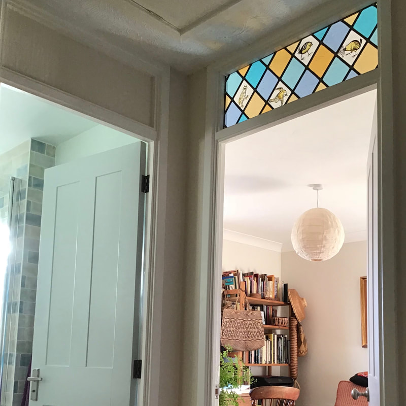
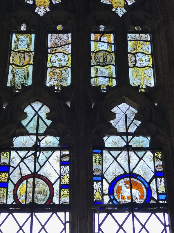
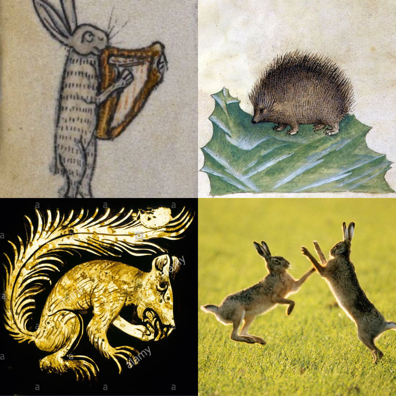
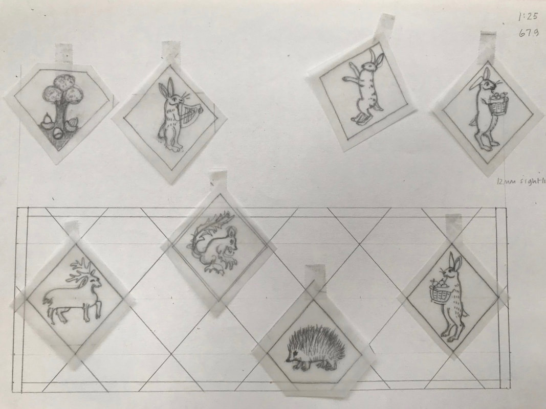
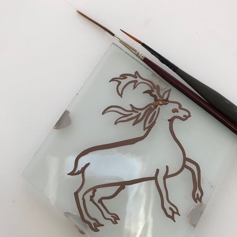
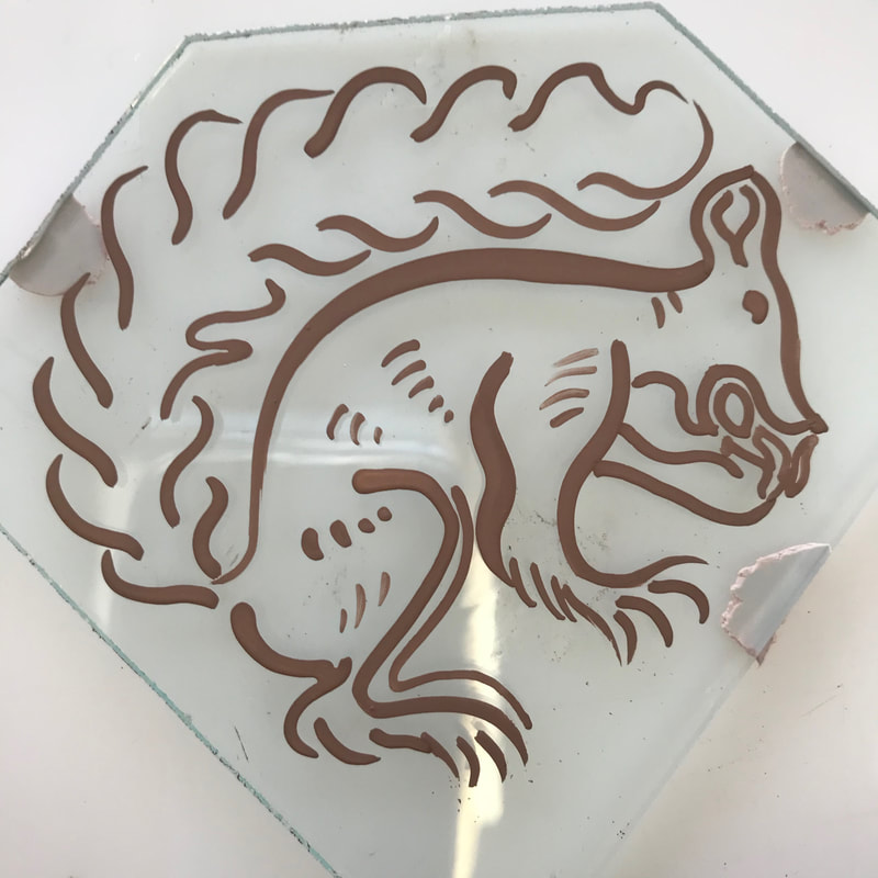
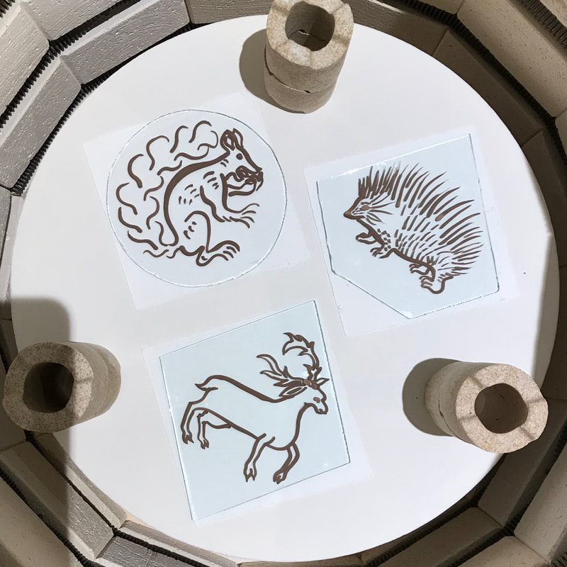
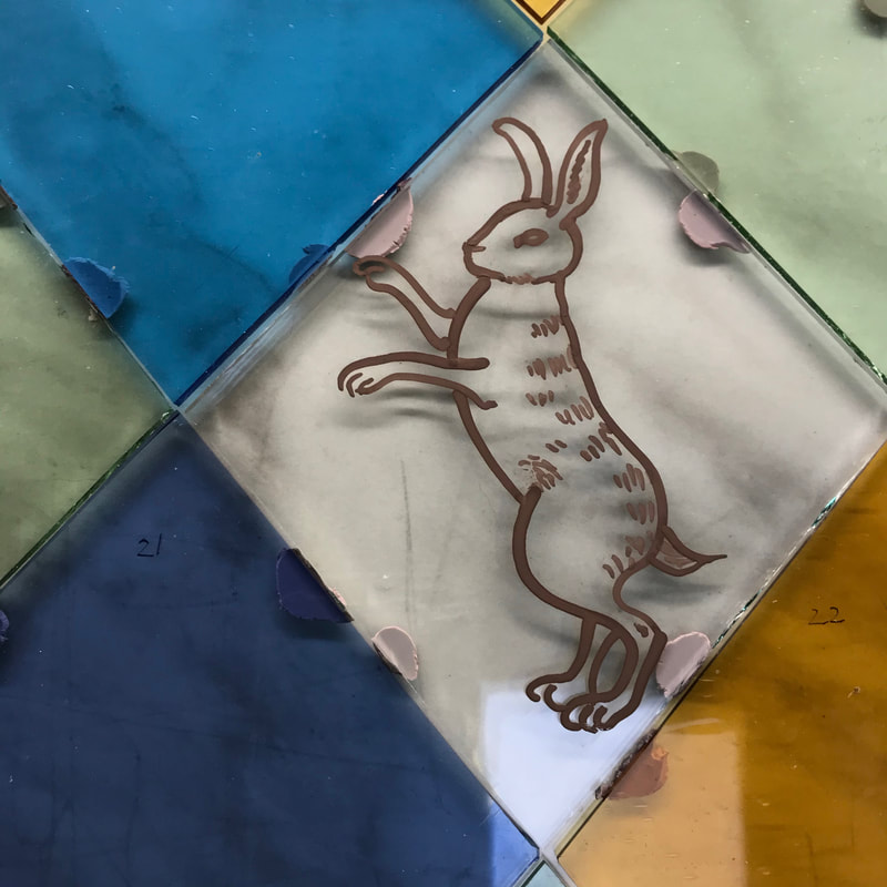
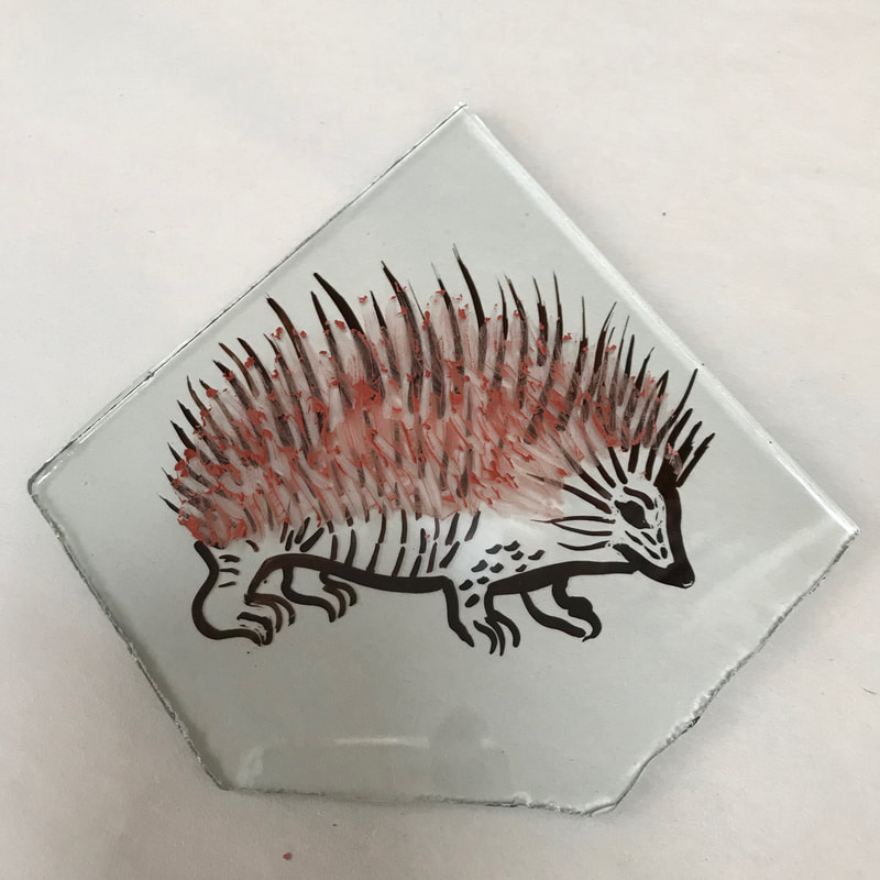
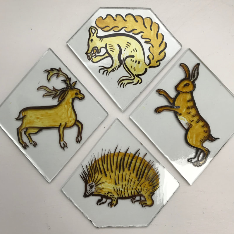
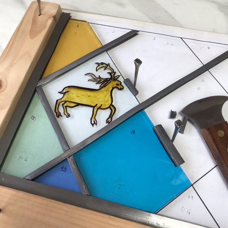
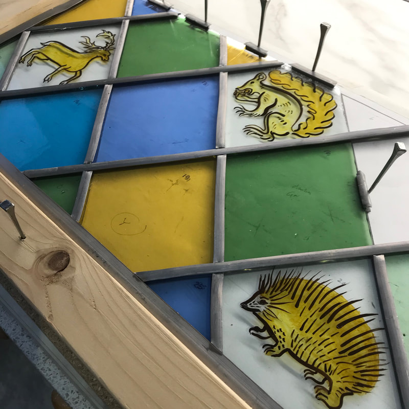
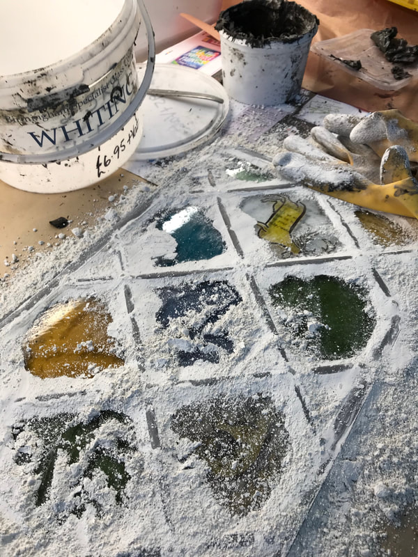
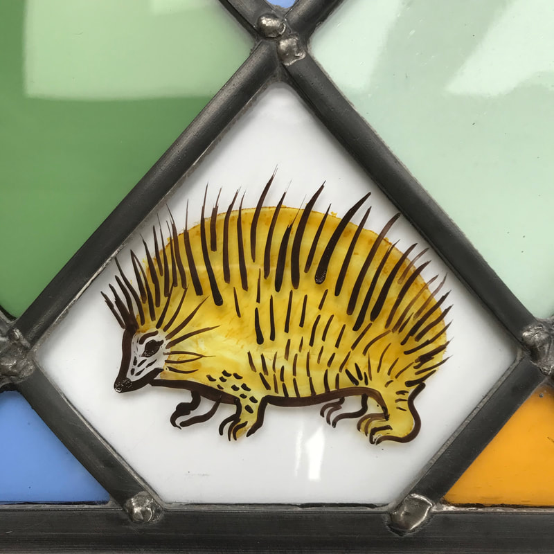
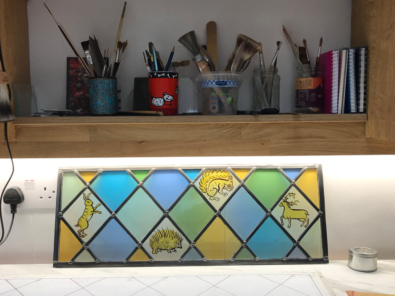
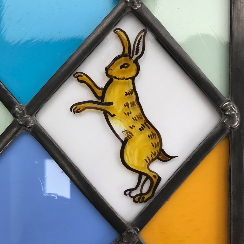
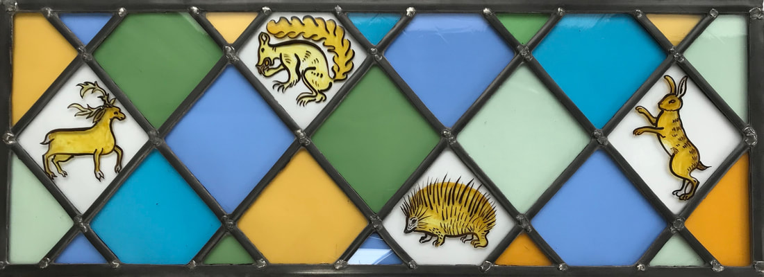
The project touches on several burning issues for us all: how do we use our land and balance the needs of national policy and local need, housing, food production, open space for walking? Where can people grow plastic-free vegetables and enjoy pottering in their sheds? Where will the birds and insects go when such areas disappear under tarmac and double garages? Early last year I made a panel featuring medieval style birds to go over an internal door. The house was built in the 1970's, but it belongs to someone with a love of the ancient. Last summer she asked me to make a companion panel for the neighbouring doorway, this time incorporating animals. The suggestion was inspired by the glass in North Leigh Church, particularly the stag, and by a very characterful squirrel in the stained glass collection of Ely Cathedral. We discussed also including a hare, and a hedgehog. I had fun looking at source material and found that in medieval imagery, a hare is often more like a naughty person than an animal. I found a beautiful little hedgehog in the 'Historia Plantarum', painted in about 1400. In the end though, a more naturalistic hare was favoured, one of the possibilities seen above as I worked out the design. While it is great to be asked to make a companion piece, it does bring challenges. My instinct was to use tone as well as line to build up the animal images, and to include some of the interesting decorative elements seen in North Leigh, but in order to be consistent with the first panel, I was confined to using just outline and yellow stain. However, the advantage of the simpler approach, given the low light levels on the landing, is that more light is let through. I cut all the pieces before Christmas and let the project rest. As I started painting I was conscious of trying to make the lines as springy and lively as possible. I find I need to focus, but in a very relaxed way, and resign myself to washing some attempts down the sink and starting again in order to achieve that. Once the outlines have been fired overnight in the kiln, I apply stain to the reverse and then fire the pieces again, to give them a golden glow. Then follows leading, soldering, cementing and finally, blacking the leads. Now it is complete I look forward to taking it to join its companion.
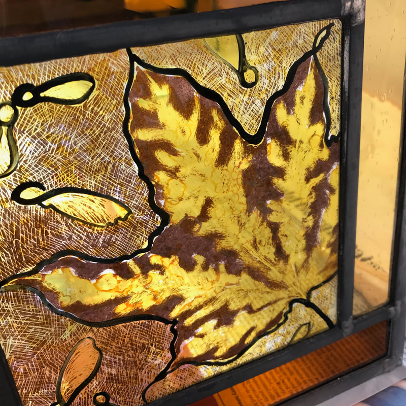
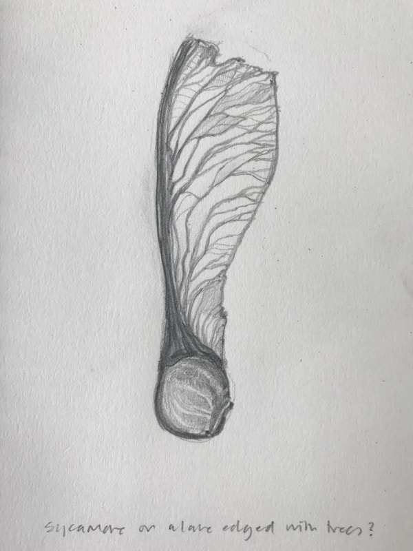
The slideshow below shows a sequence of work beginning with a tiny sycamore seed found while we were staying in the Scilly Isles. Although I am pleased with the panel, and the looser marks and splodges of stain, I feel I am still not done with the sycamore seed, not the row of sycamore trees in Scilly. I shall return to them one day.
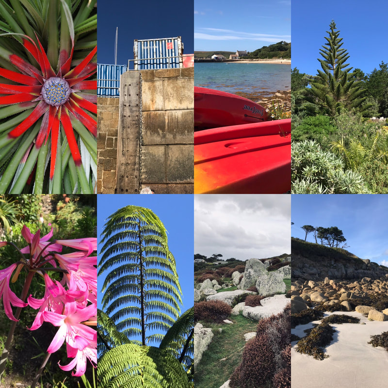
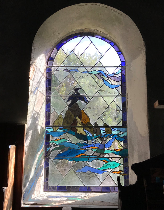
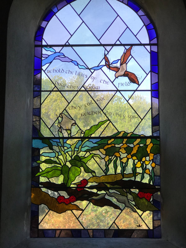
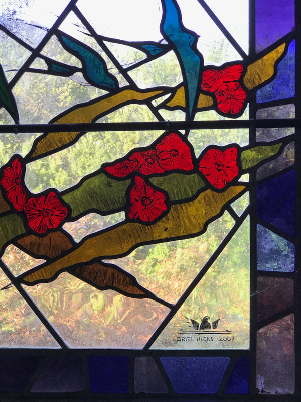
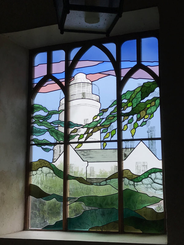
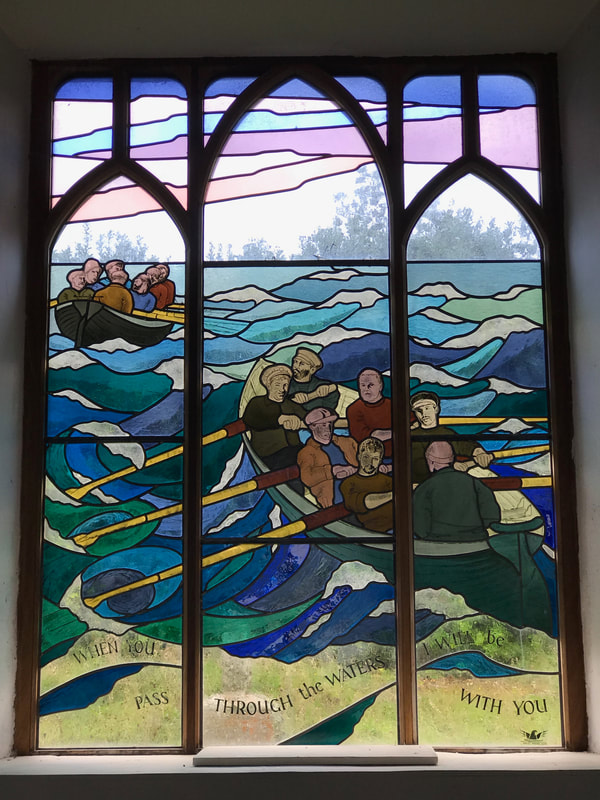
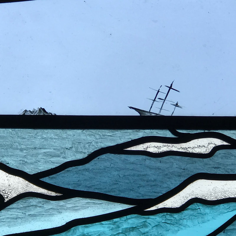
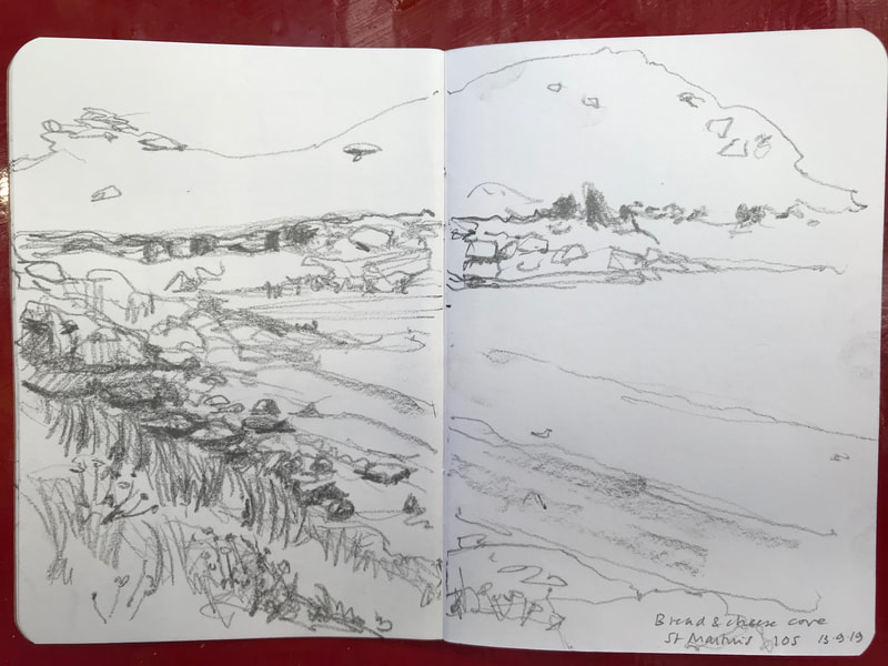
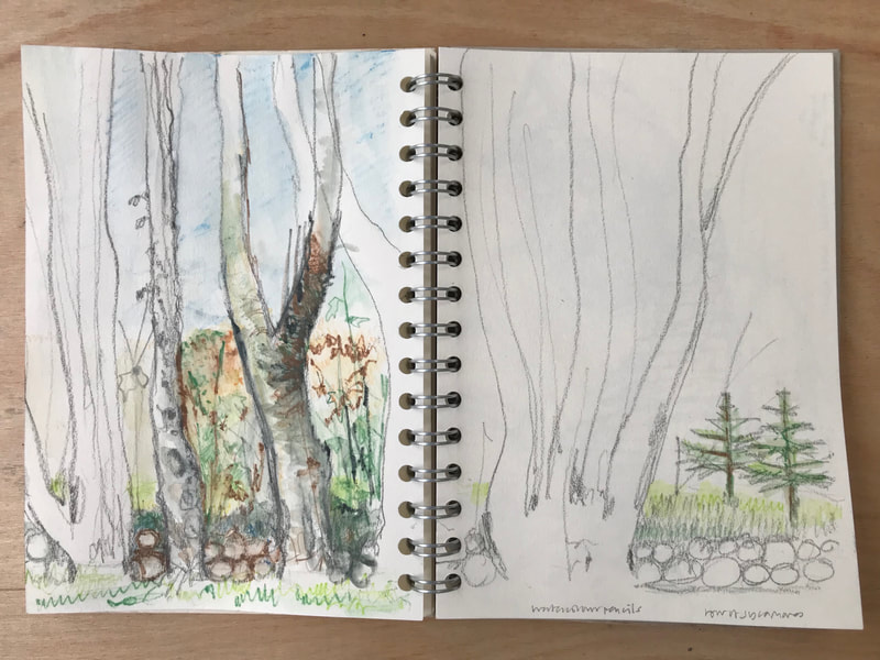
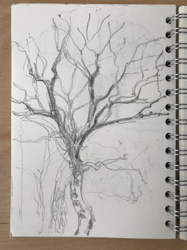
We have recently returned from a week in the beautiful and wild Scilly Isles, 28 miles off the Cornish coast, and well-loved for their lush flowering plants, sandy coves, turquoise seas and brilliant light. There are very few cars, and exploration happens on foot, or on bicycles, by boat, or if necessary, golf caddies! During our exploration of the archipelago, we found two churches furnished recently with stained glass by local glass artist Oriel Hicks, who runs the Phoenix Studio on St Mary's. The windows in the church on Bryher are a setting of Biblical texts, and I noted that the design elements are set within a framework of transparent glass, which allows in a lot of light. On the tiny wild island of St Agnes, her windows are a tribute to those who risk their lives at sea. I found these designs more satisfying, and I enjoyed spotting a lovely detail: a tiny ship on the horizon, foundering on some treacherous rocks. I drew every day, out on the coast paths and back in the north of St Mary's where we were staying. I enjoyed drawing the swaying rows of elms (yes, elms) and sycamores. Elms and thrushes have survived on the islands, while they have been wiped out or gone into decline on the mainland. I loved the upright curves of the tree trunks, and what could be see in between, which of course makes me think of lead and glass. I focused down on one tiny sycamore seed, and it was this drawing which took me forward on my return to the studio.
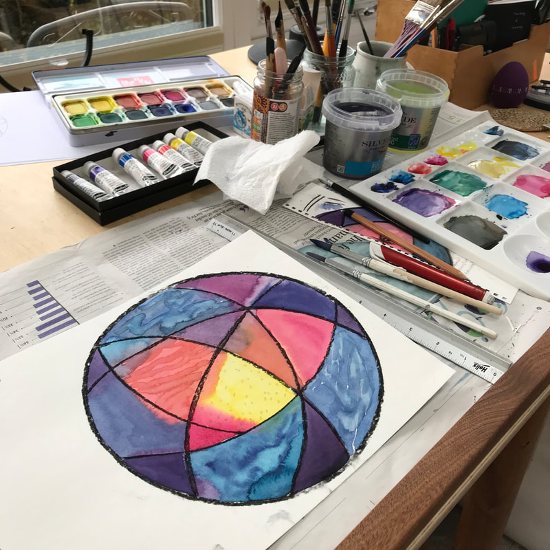
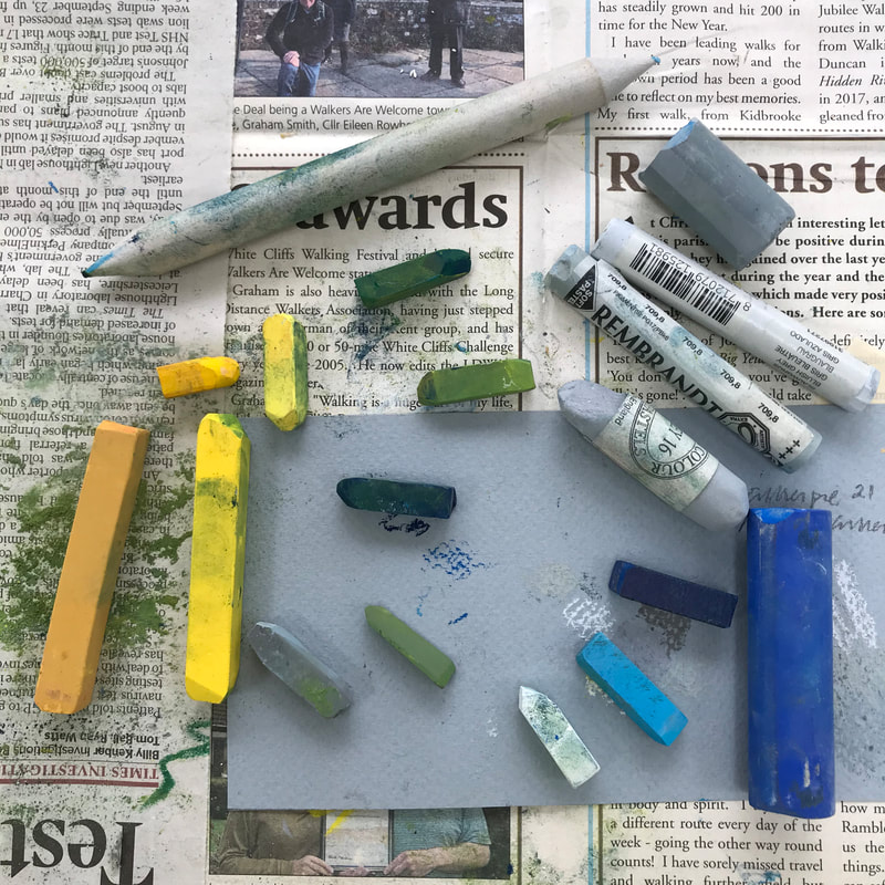
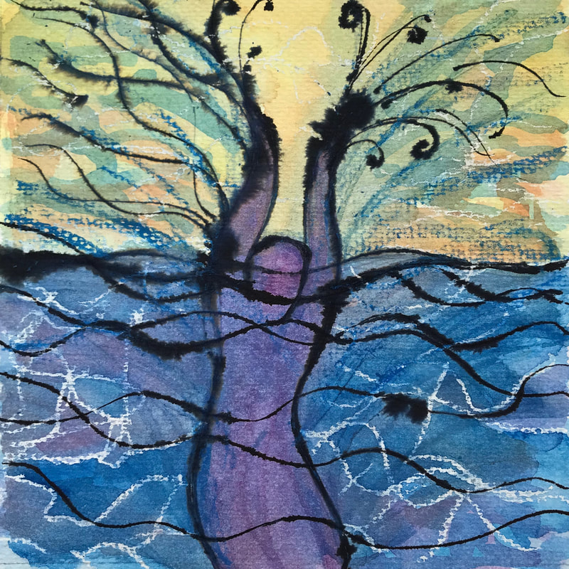
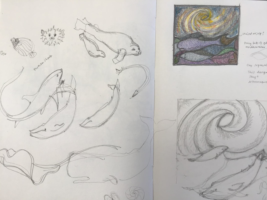
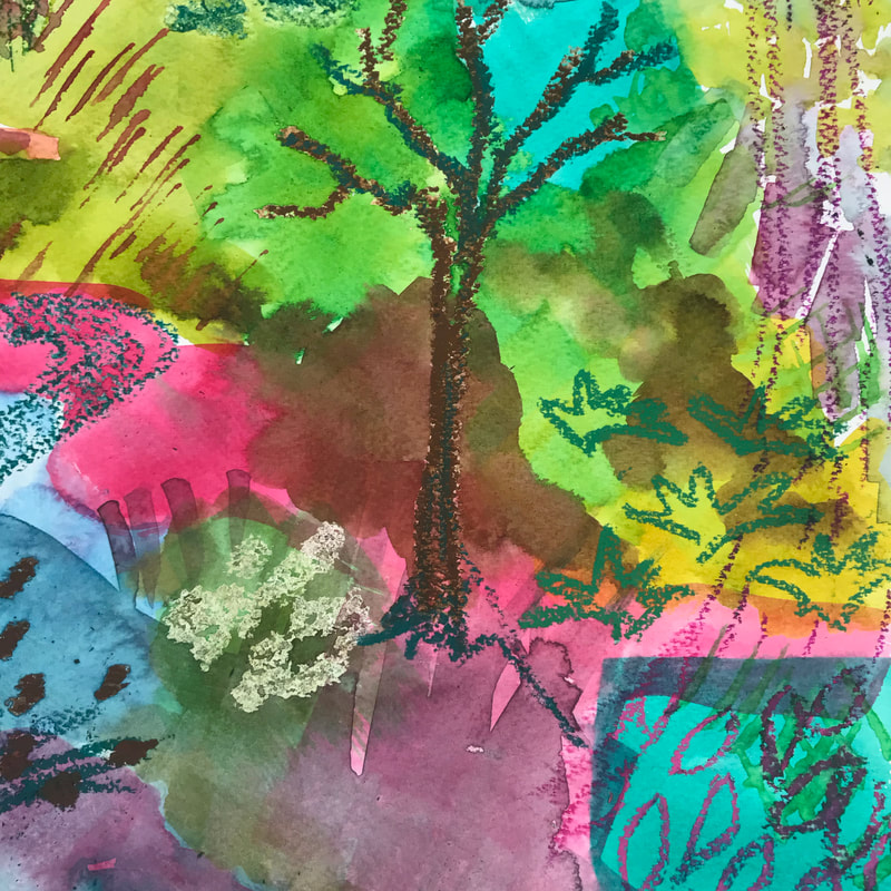
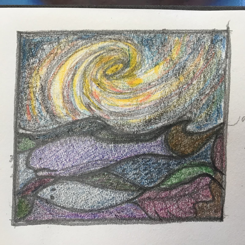
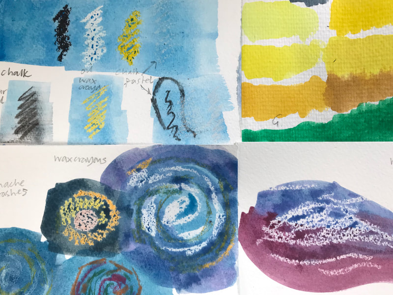
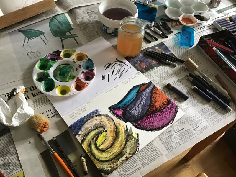
For several months now, I have had ideas and images in my head, which relate to Creation, as in Genesis: In the beginning....' I am of course not the first glass artist to be drawn irresistibly to imagining the separation of the light from the darkness, and the time when darkness was upon the face of the deep. I also love the idea of dividing the waters from the waters, and gathering the waters under the heaven into seas. The issue for me is, how to capture those ideas and internal imaginings on paper, in such a way that they can be developed and shared with others. I am happy with a pencil in my hand, and up until now I have used coloured pencils to suggest the colour of the glass I imagine, but pencils don't give me the intensity of colour or much suggestion of texture, as the light comes through the glass. I have become confident about line, but I need to be able to experiment with the balance of colour and tone across the composition. I also need a more effective way of showing commissioning clients what a finished design is intended to look like. So with all this in mind, this summer I refreshed my experience of using 'mixed media' with a workshop by the painter Ella Clocksin at Waterperry Gardens. We had the opportunity to draw in the garden and then try using wax resists and washes of professional quality watercolour paint, along with marks made with oil pastels and chalk pastels, on good quality, textured paper. One of my experiments from the day is below. I have since started to build on my initial pencil sketches for 'creation' ideas. I want to suggest the birth of our galaxy, with sea creatures under the surface of the water, ready to be born. Having a much wider range of colour and textures is helping my imaginative and design process, and I think it is going to be useful to make finished designs, which will convey my intentions for the final piece better to other people.
I have a long way to go on this project, and I'd like to move away from an illustrative approach. I am looking forward to continued experimentation, and to going larger. |
AuthorI am a glass artist based in Charlbury, Oxfordshire. I work in stained and fused glass. I work to commission and teach stained glass in my studio. I open my studio to visitors during Oxfordshire Artweeks. Archives
July 2023
CategoriesStay in touchTo follow my blog in your favourite browser please click on the RSS Feed button below. You can find me on social media or just subscribe
to my newsletter. |
Copyright © 2015
 RSS Feed