|
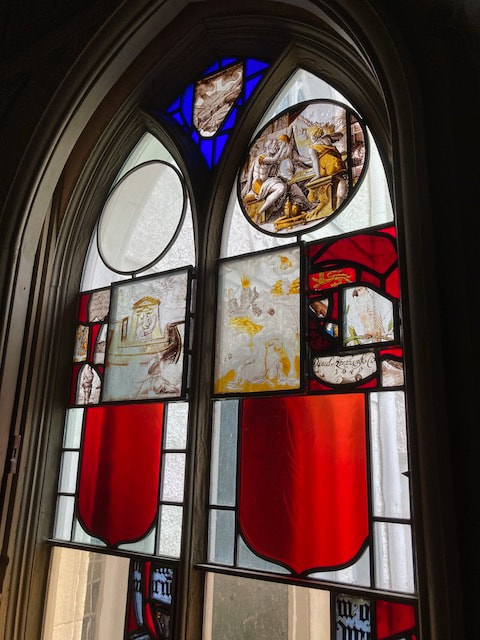
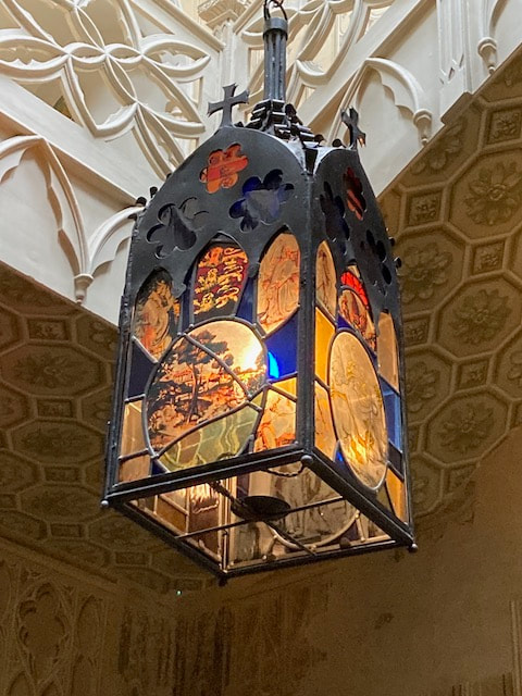
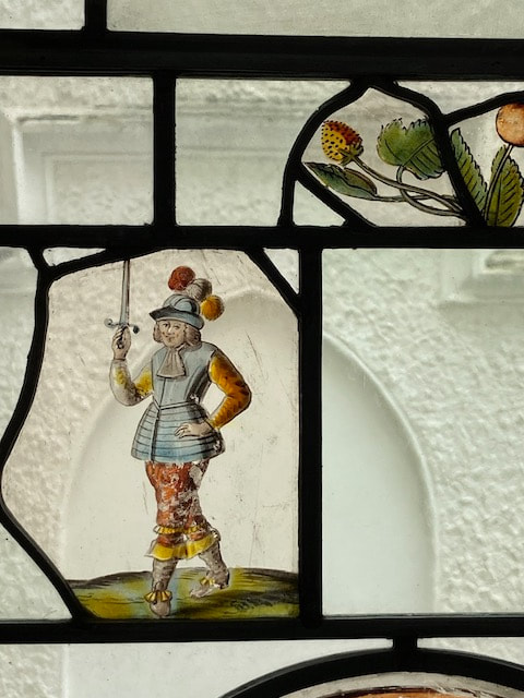
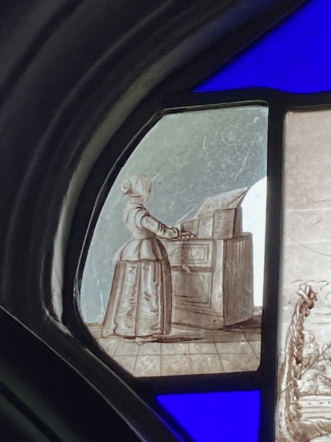
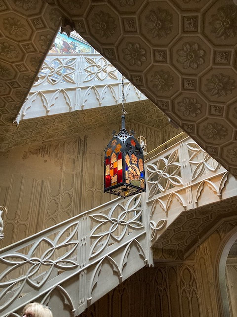
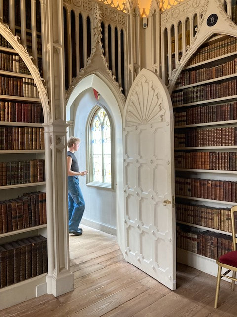
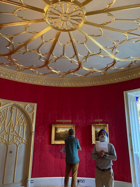
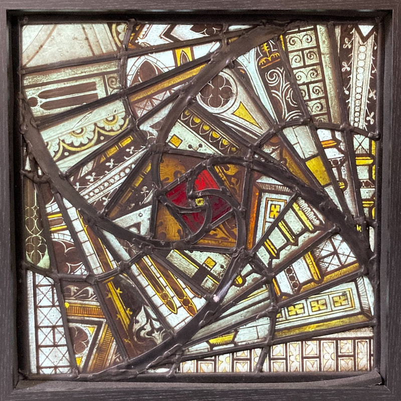
I have just returned from a fascinating visit to Strawberry Hill, a little gothic castle created in leafy Twickenham by Horace Walpole. The younger son of Robert Walpole, our first Prime Minister, Horace bought a modest house in 1748 and spent the rest of his life extending and remodelling it according to his historical imagination. He wrote that his greatest pleasure in directing operations was the glass: I have amassed such quantities of painted glass, that every window in my castle will be illuminated with it: the adjusting and disposing it is vast amusement. (letter to Horace Mann 1753) This is what comes across - a huge sense of enjoyment and fun, and of a project that just grew and grew. Biblical scenes, tropical birds, heraldic images are displayed throughout the house in magpie mosaics or set amongst bold plain blues and reds. His collection is even collaged to create the impressive lantern, which tells you what is to come as you enter the stairwell. Where did the glass come from? Walpole commissioned an Italian called Asciotti, who was married to a Fleming, to go to Flanders to obtain painted glass. He returned with 450 pieces of glass from the Low Countries, dating from about 1540 to 1660. To add a sense of his own family heritage Walpole also commissioned some armourial glass from William Peckitt. Although the contents of Strawberry Hill were dispersed in the Great Sale of 1842, about half the glass remains and it has been restored in the arrangements that Walpole intended. The fashion for collecting continental glass, which Walpole kick-started, only benefited from the upheavals of the Napoleonic wars in Europe. Although Walpole didn't want to obscure the views from the house - to the river in particular (sadly no longer visible) - he was keen to create the necessary gothic 'conventual gloom' 'which however, when the sun shines is gorgeous, as he appears all crimson and gold and azure thought the painted glass' letter to Horace Mann 1784. Walpole's vision of 'the gothic' is much lighter than versions which followed. My personal favourites amongst the glass are the little celebrations of 17th century dutch life: peasants, burghers, a girl playing a keyboard. They have charm and a lightness of touch, giving little glimpses of affluent Dutch society at the time. The whole house is a delight, as long as you jettison any ideas such as 'truth to materials', as it is all about impression and atmosphere: papier mache imitating stone work, Tudor side chapels being lifted to create fantastical fireplaces. There is whole scale architectural pillaging and repurposing and a huge love of pinnacles. Rouen cathedral, in particular, is ransacked for design ideas, with rose window traceries turned into ceiling designs, for instance. The house was of course extremely influential and more information can be found here. Michael Peover has written an excellent little book about the glass. Finally, it is good to note that while Heritage Crafts has recently put stained glass on its Red List, there has just been a very positive (and hard won) development: the establishment of a new apprenticeship scheme for stained glass makers delivered by Swansea Glass School. This will do something to redress the loss of many practical craft courses in our universities - especially those needing costly resources such as kilns.
0 Comments
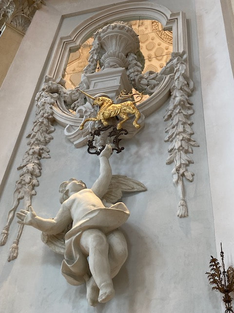
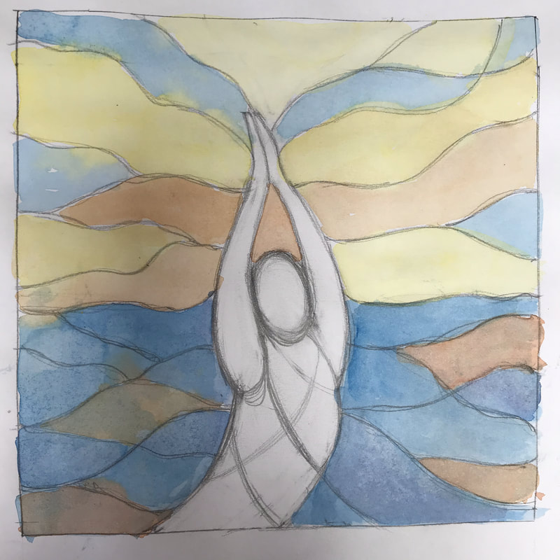
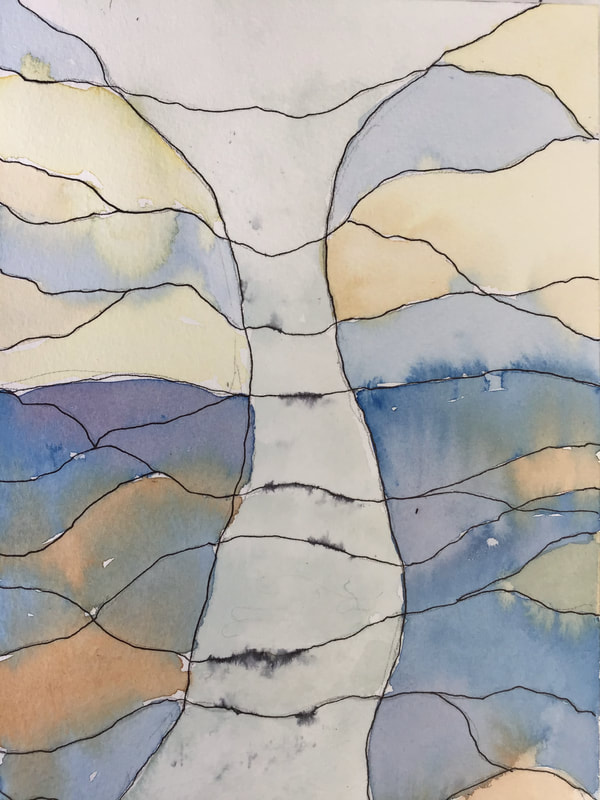
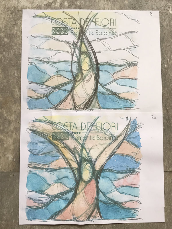
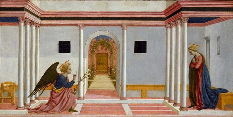 Domenico Veneziano, Annunciation Since being commissioned to create a window featuring an angel for a house in Tuscany, I have been on the look-out for angelic beings. Even without the Italian connection in this project, what first came to my mind was a memory of a small Italian Renaissance panel I loved in the Fitzwilliam Museum in Cambridge, when I was a student of art history. We were very lucky, because the Fitzwilliam was 'our' collection, along with Kettle's Yard. In those days we could borrow a picture from Kettle's Yard to have in our room (and that is where I got my lifelong affection for Ben Nicholson's work). The panel is a part of a predella, painted as the lower part of an altarpiece and it depicts the Annunciation. All is peace and order in this beautiful stage set and the Angel is Gabriel, bringing a momentous message to Mary. He holds lilies, a symbol of Mary and her purity as a young girl. His wings are dark, suggesting a bird of prey, or a black swan. For my project, this profile appeals, as does the finger pointing heavenwards. Mary is, understandably, overawed. 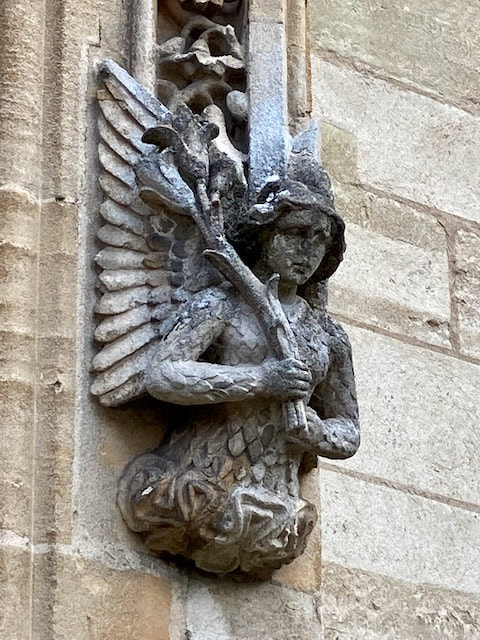 Once your mind is on angels, they are everywhere. Here is one I spotted in the first quad of Magdalen College, holding the very same lilies. Again, the lovely hair, splendid wings, but this angel's body is dressed in leaf or feather shapes. This is possibly armour, which we will see more of later. The angel maintains his dignity, averting his gaze from the gurning gargoyles on the opposite side of the quad. We have just returned from a trip to Northern Italy and of course, angels were in evidence. Waiting for me in the Cathedral in Turin was this youthful angel, below, wearing beautifully described armour and a softly folded cloak. Perhaps he was originally holding a spear? He is slim and graceful - a little like Donatello's David in Florence, and standing with his weight more on his right leg - a position called 'contraposto' which creates a feeling of life. Again he has curly hair, and here, a little smile, despite his chipped nose. He might be the archangel Michael. There is a heirachy of angels and at the top are the archangels, chief of which is Michael, who is their protector, and so he tends to be depicted in armour. 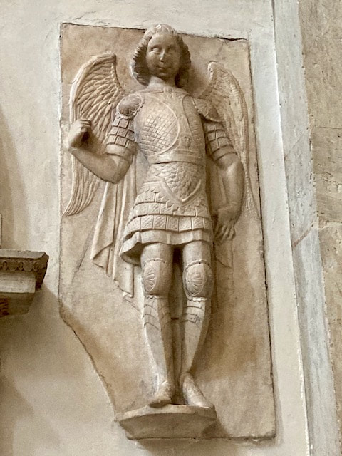 Much further down the rankings come cherubim and seraphim of all kinds, which are also in evidence in churches and palaces. On the left are cherubic plump faces framed by two sets of wings, while on the right, the lavishly decorated Borromeo Palace on Isola Bella on Lago Maggiore is full of baroque 'putti', seen here supporting a golden unicorn. Set in a stunning small garden on Lake Como is the Villa Melzi, which has a rich collection of antiquities - most of them Etruscan (and one or two fakes, apparently). Here I found a pair of intriguing golden earrings - see my drawing below left. Each earring is formed of a disc with a stylised flower and hanging from it, in what looks like solid gold, intriguing winged figures,. They have halos set with grains of gold and each figure holds what looks like a musical instrument. Their legs seemed to me to be covered in fish scales. If these earrings are Etruscan, then they predate Christian angels by centuries. 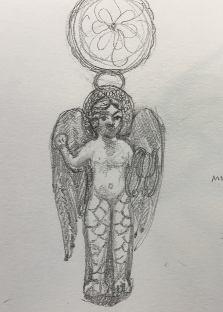 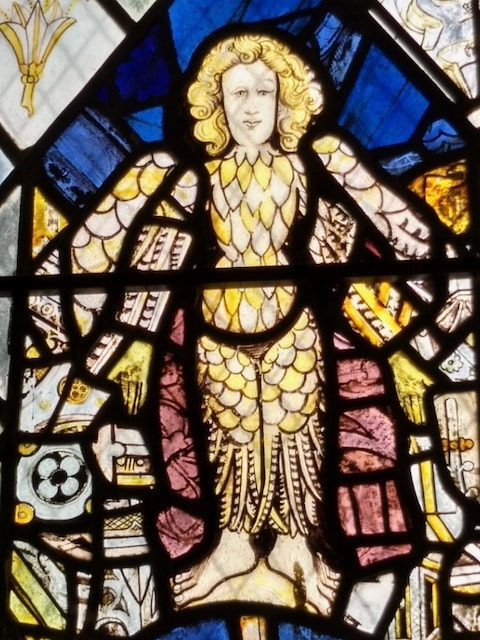 I knew I had seen similar scaly legs before on a figure closer to home, and here on the right is the window I remembered having seen in St Bartholemew's church in Yarnton. This sturdy-footed angelic being is covered in what I can see now must be feathers all the way down to his ankles, as the lower part of his body-covering looks like pheasant feathers. All these angels will feed my imagination when I am designing the angel window for Tuscany, but I can reassure my client that I will probably set aside the idea of enormous sturdy feet and feathery legs.
Yesterday I had a real treat: a walk and talk about the stained glass in Christchurch Cathedral, led by Peter Cormack of the British Society of Master Glass Painters (BSMGP). It was marketed as part of the Oxford Festival, and I have made you a slideshow of some of my personal highlights, below. Edward Burne Jones is the designer of the Cathedral's most famous window - the Frideswide Window, which tells the story of her eventful life and determined rejection of marriage to a Saxon Prince. What I hadn't appreciated was the nature of the creative partnership between Burne Jones and William Morris, which began when they were students at the University. As soon as they graduated they created the murals in the Oxford Union, which was an adventurous commission for the Union. As they began their stained glass career, Burne Jones designed the window, but Morris chose the glass, with his exceptional eye for craft quality, colour and pattern. For instance, he selected 'spoilt' ruby glass for halos, using the variegated texture to best effect. Burne Jones' terrific design skills can bee seen in the panel showing the death of Frideswide, set in a lovingly detailed medieval interior. In the slideshow you can also see that compositional skill in David slaying Goliath. Another element which Peter Cormack pointed out, so that I shall always see it, was the delicate use of yellow stain on blue glass in Burne Jones' 'Hope' (Spes) in 'Faith, Hope and Charity'. In the Chapter House there are more square panels, this time completely contemporary. This is a chance to see the BSMPG's touring centenary exhibition of small, often intricate panels of glass made during lockdown. I have chosen three examples below. To see them all click here The linked pages give a good overview, but nothing beats seeing the real thing. The exhibition will be at Christchurch until 10 July. Enjoy!
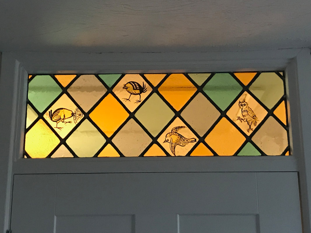
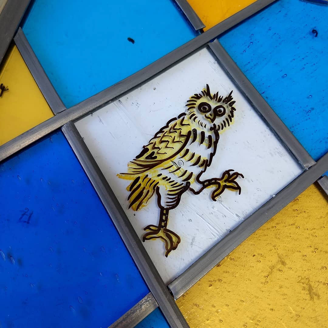
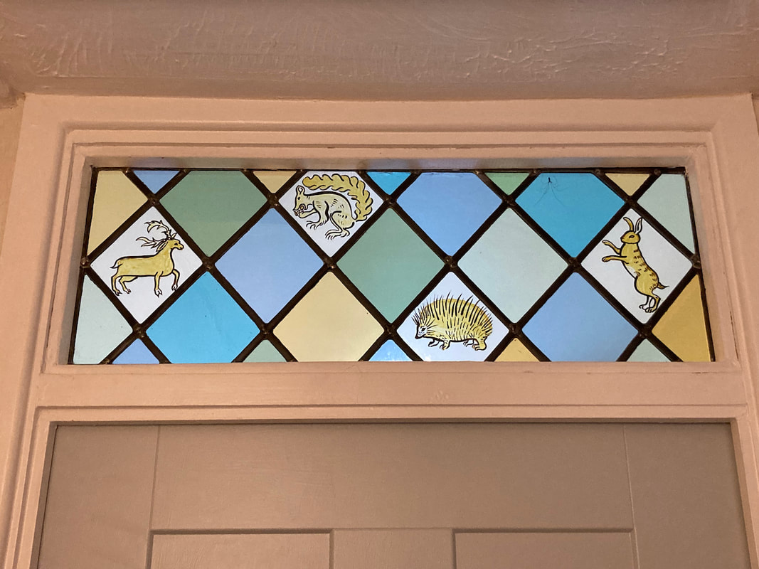
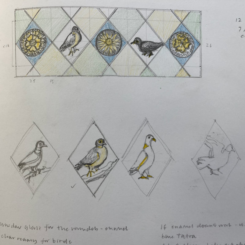
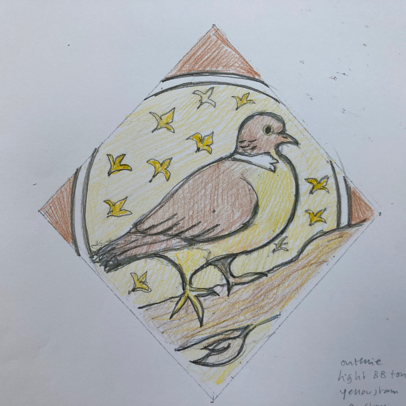
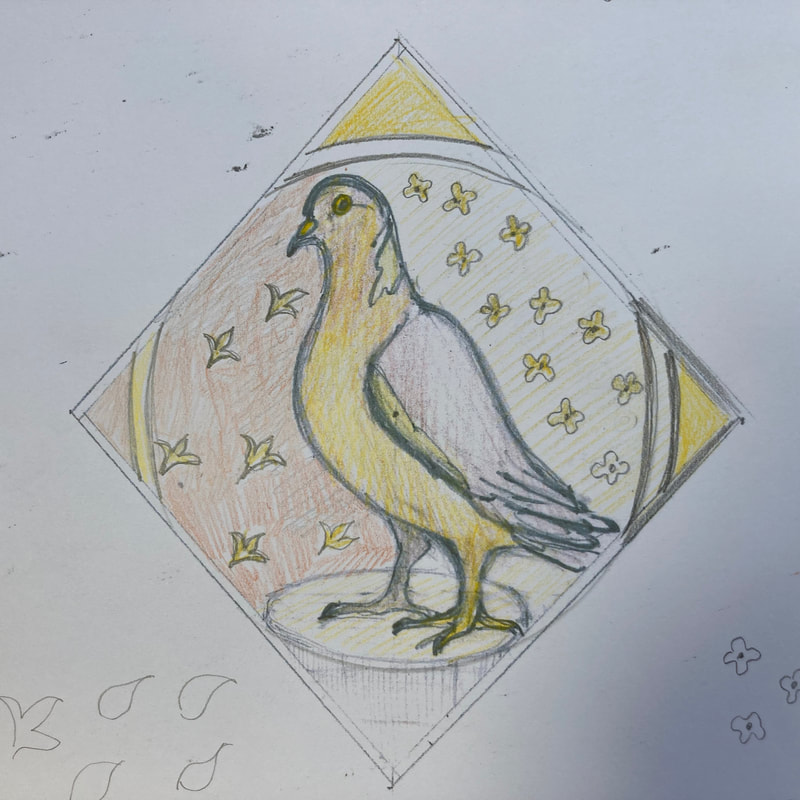
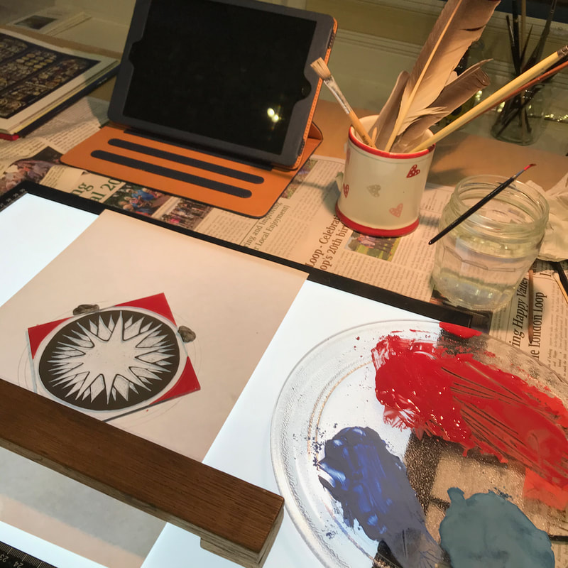
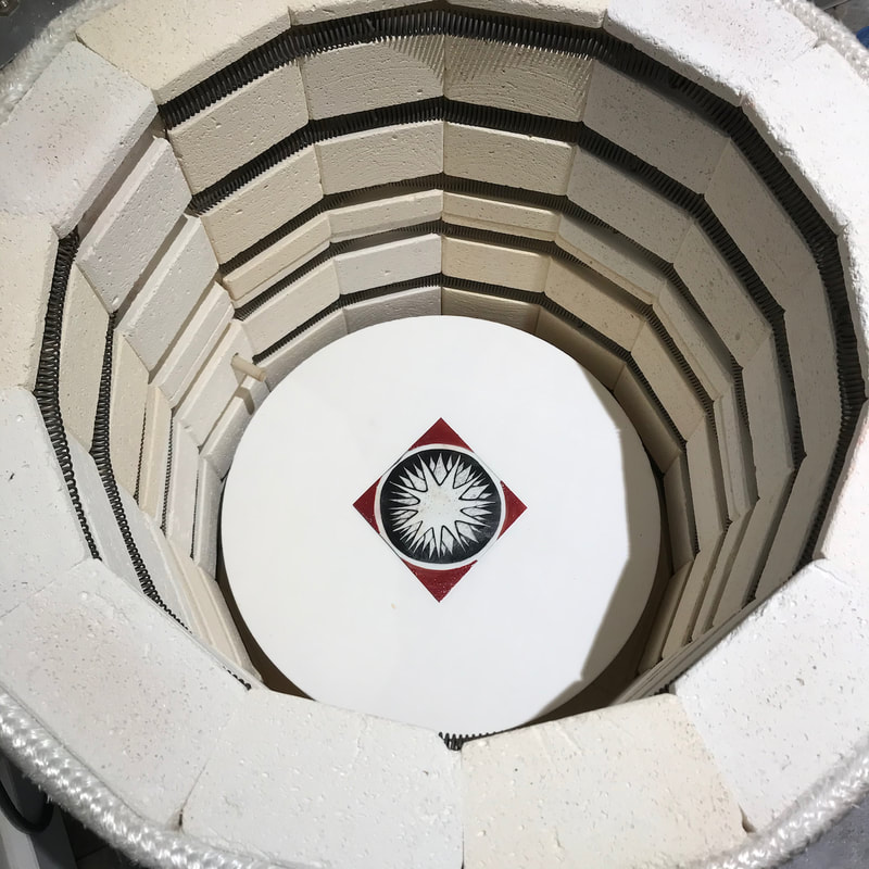
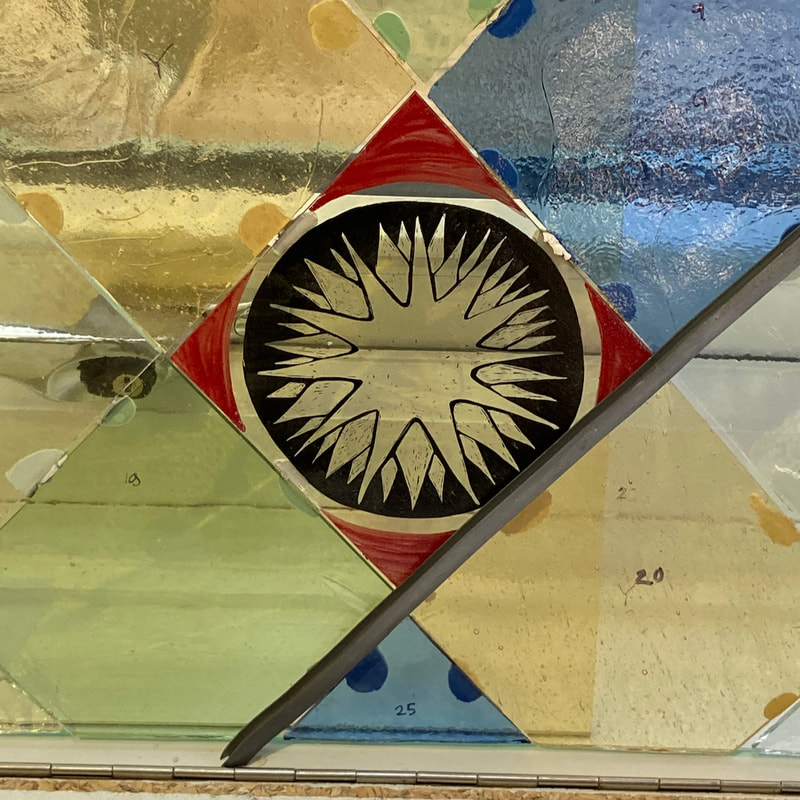
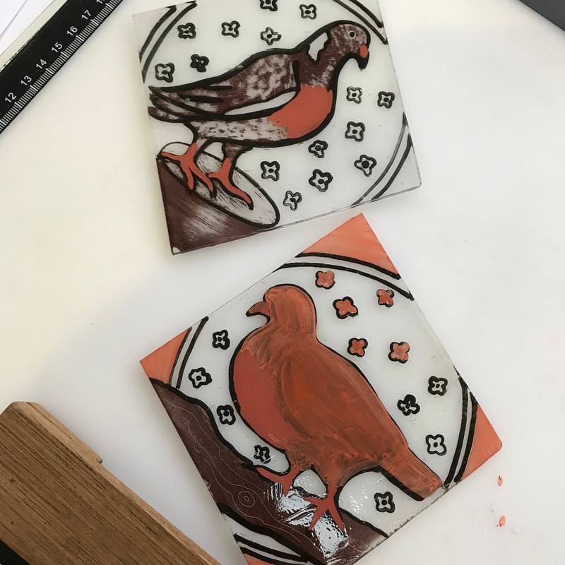
I am very fortunate with my clients and those of you who receive my newsletter know that I have been making a third window for someone with a keen interest in history. My panels replace internal windows above doors in the upstairs of their 1970's house in Charlbury. The previous owner had simply painted over them, which was not a good look. The first window I created was a lattice of diamond shapes (or 'quarries') populated with birds inspired by medieval glass in St Bartholemew's Church in Yarnton and York Minster. The second window featured animals - a deer, a hare, a squirrel and a hedgehog. For some of these images I looked at illustrated manuscripts, as well as glass. For the third window, which is over the door into the study, we became grander in our inspiration, looking at the stylised emblems in Holy Trinity Church in Tattershall. The client also wanted to incorporate the plump wood pigeons she sees in the garden below. The research and design process is key to the success of the project. The birds I could find in images of glass were often doves or eagle-like. My challenge was to observe woodpigeons and interpret them in a medieval(ish) style and using my limited materials and tools. I am of course not a medieval artist, and I wanted them to be both stylised and alive and recognisable as pigeons. 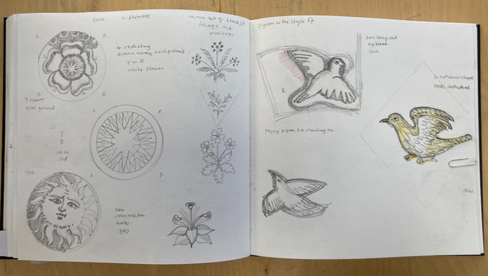 There is a strong problem-solving aspect, too. Elements that I was guessing were done on a larger scale with separate pieces of glass, I decided to create using enamel. Red was chosen to add to the heraldic character of the star and roses. Like the layers of glass paint, enamel contains ground glass and it is fired onto the glass in the kiln, fusing onto the surface. Working on clear window glass for the emblems and handmade reamy glass for the pigeons, I traced the outlines in black, fired them and then applied a matt of paint to to be drawn into and scraped away. For the pigeons I used a bistre brown matt and a stiff old hog hair brush to suggest the sheen of feathers. After firing again, I applied two different strengths of silver stain to to the reverse to build up a golden glow in some areas. I virtually never wash the stain palettes as the powder is so expensive and I can manage to revive it. I kept keep checking on how each piece was fitting into the whole, sticking the pieces on a glass 'easel' with blobs of plasticene. 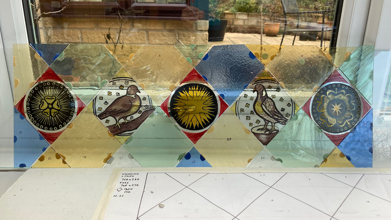 Then it was time to lead, solder, cement, clean up the panel and black the leads. I put it in gentle internal light at home and was pleased to see all the different textures of the glass chosen: seeded (bubbles), reamy (wavy lines), crackle, rolled... 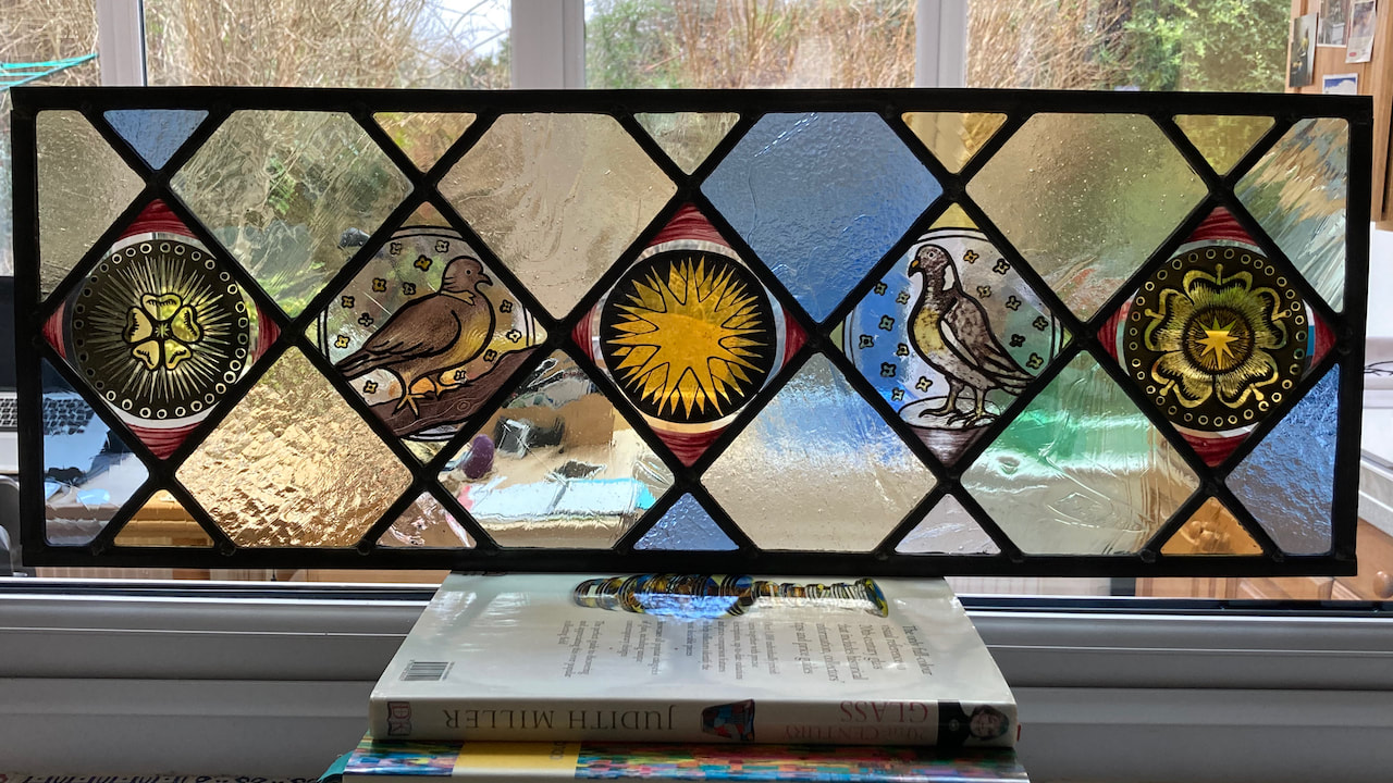 And today I have seen it installed in the doorway. You never know until you see it in situ whether it has worked, and I was so glad to see the morning sun shine through and create an inviting entrance to the study. 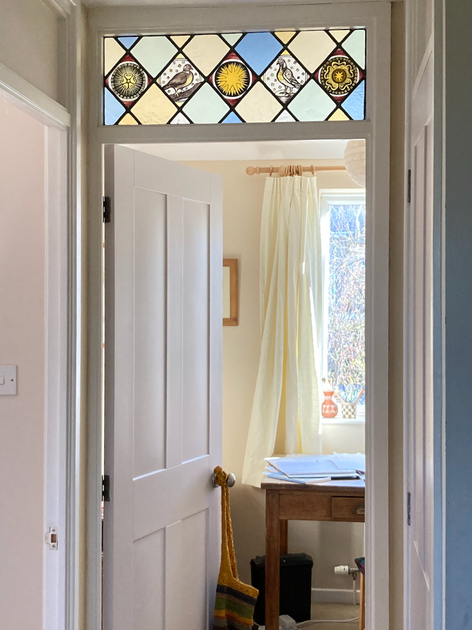 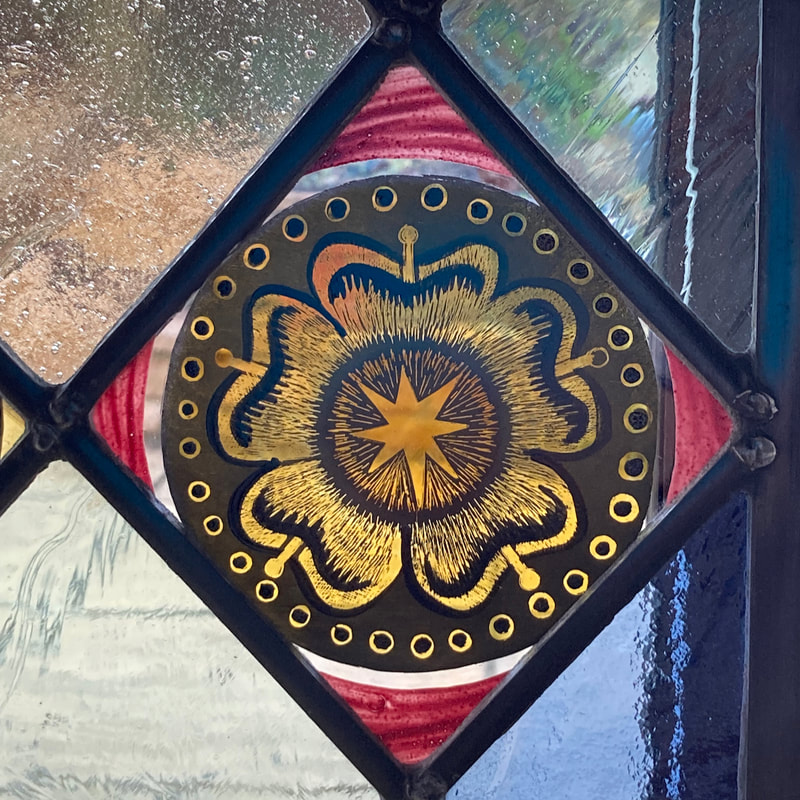 I am just back from seeing an exhibition called 'Mixing it Up. Painting Today' at the Hayward Gallery on London's South Bank. I tought it would be interesting to see what is happening in painting at the moment. Reports of the death of easel painting are always premature and this exhibition was indeed full of life, with a wide range of artists and subject matter - mostly narrative, imaginative, and often political. Half way through I was surprised to stumble upon what looked like some kind of stained glass mounted in the concrete exterior wall. I could see vivid colour and translucency and it definitely wasn't painting, which was interesting, given the theme of the exhibition. On closer inspection I could see it wasn't glass, either. 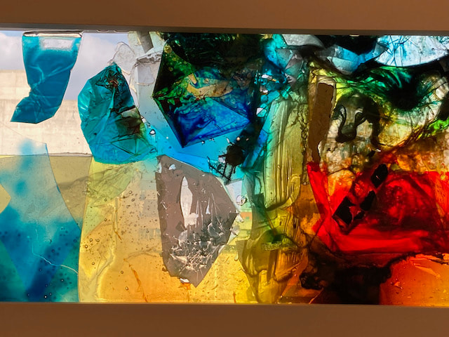 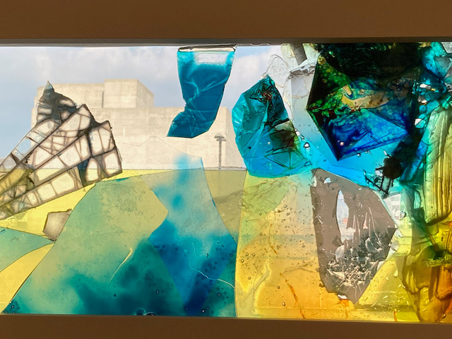 Transparent areas allow the viewer to see the rugged outline of the Queen Elizabeth Hall This is the work of Samara Scott, who makes 'paintings' using household liquids such as cooking oil and shampoo and discarded objects, captured between sheets of Plexiglass. 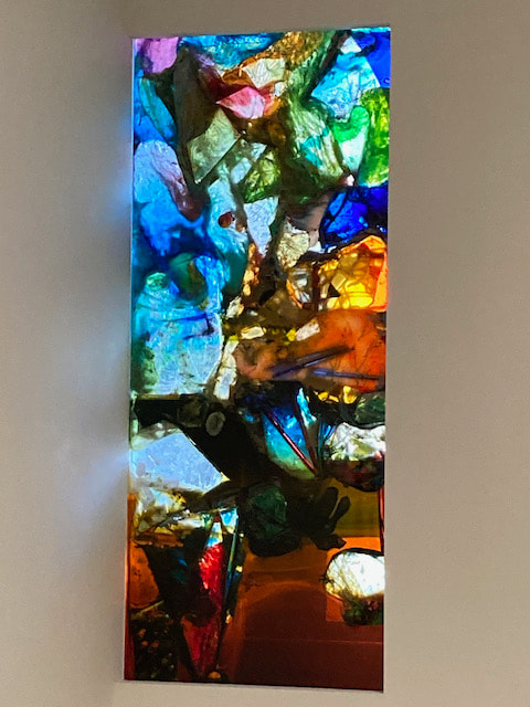 Aesthetically rich and pleasing to the senses, this piece, called 'Shannon Ridge' contains fabric softener, ink, plastic, oil, and electrical cables. What you might call mixed media meets objets trouves.
Scott says she finds discarded materials poetic. The solid materials settle over time, so the final composition is partially accidental. She describes her work as 'almost a total resistance' to painting: something that she similutaneously tries to avoid and that is always hovering. To the artist, these works are 'elixirs', 'broths', 'potions of this era'. Her inclusion in a survey of Painting Today is interesting, but with my interest in translucency, it was one of my highlights of the show. In the exhibition commentary there was no mention of any kind of environmental comment or protest. As I travelled home I reflected that around here in Oxfordshire it might be more authentic to incorporate a little horse dropping, some wheat chaff, rotting apples and the odd lost face mask. Here is a slideshow showing the latest progress in making the Swimmer. Experiments with the lightbox are ongoing, but we are working towards installation. You may remember that last year during Lockdown One, I wrote a sequence of poems called 'Breathe', which I then illustrated to create a book. For one of the poems, 'Swim', I made made a whole sequence of images, always trying to get closer to the experience of resurfacing through the water back to breathing air. As I said in my blog (June 2020) some of these ideas started moving sideways into sketches for glass. Some seemed more likely to succeed than others, but I have learned to keep everything, just in case. A friend expressed an interest in these ideas for glass, as she is also a keen swimmer and loves the experience of looking up at the light, from under the water. Once she had moved house and created a new room on the back, the stage was set - I was invited to create a design for a stained glass panel, not for the window (they are all folding doors), but for the wall. I managed to visit, with all the doors thrown open for ventilation in these strange times, to firm up the idea: we decided to illuminate the glass from behind, by creating a light box of about 50 by 50 cm. So I set to work, revisiting the earlier sketches, but coming at it afresh. 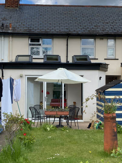 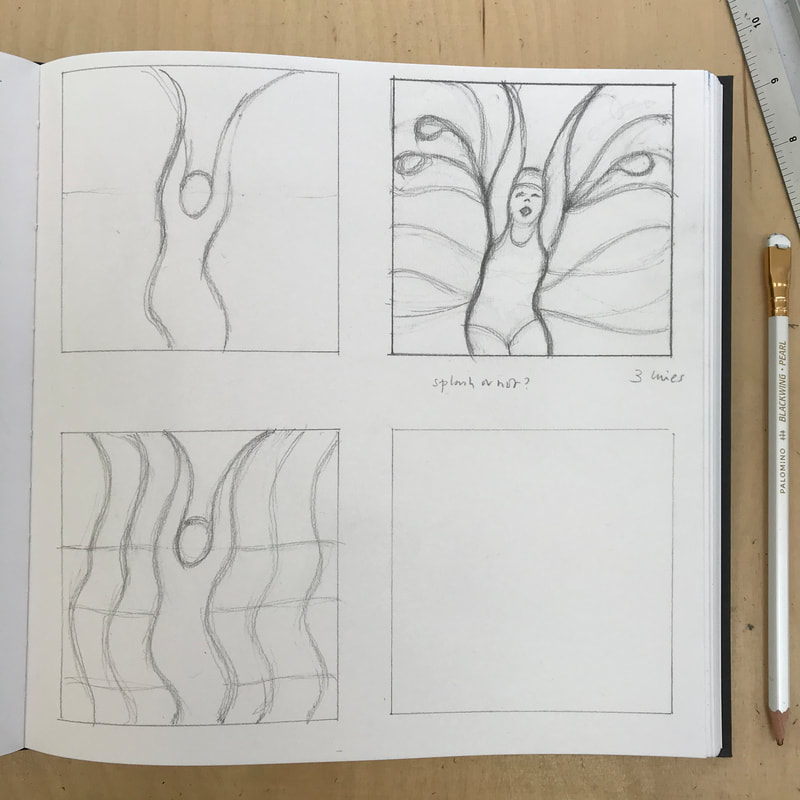 I wanted to capture the movement of the swimmer and the water and the sense of the boundary between water and air. I was happy to have it unclear as to whether she is dropping down into the water or rising up out of it. 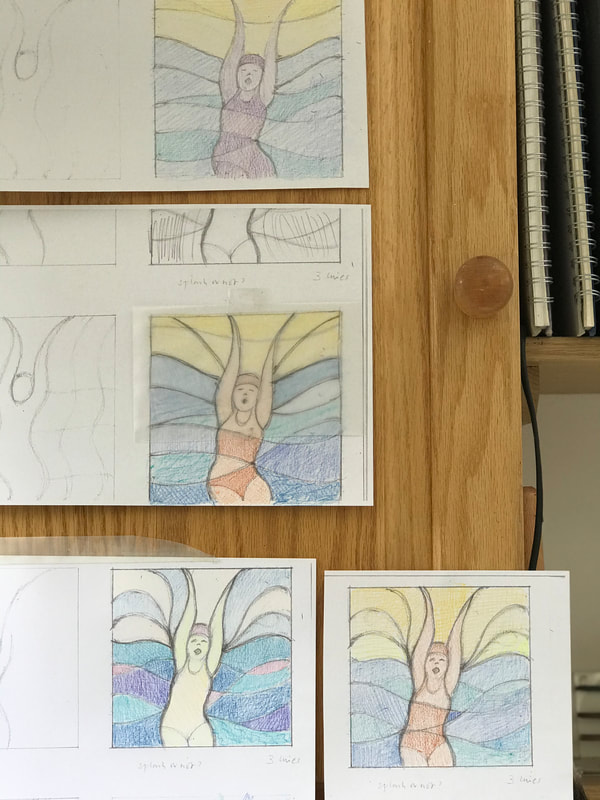 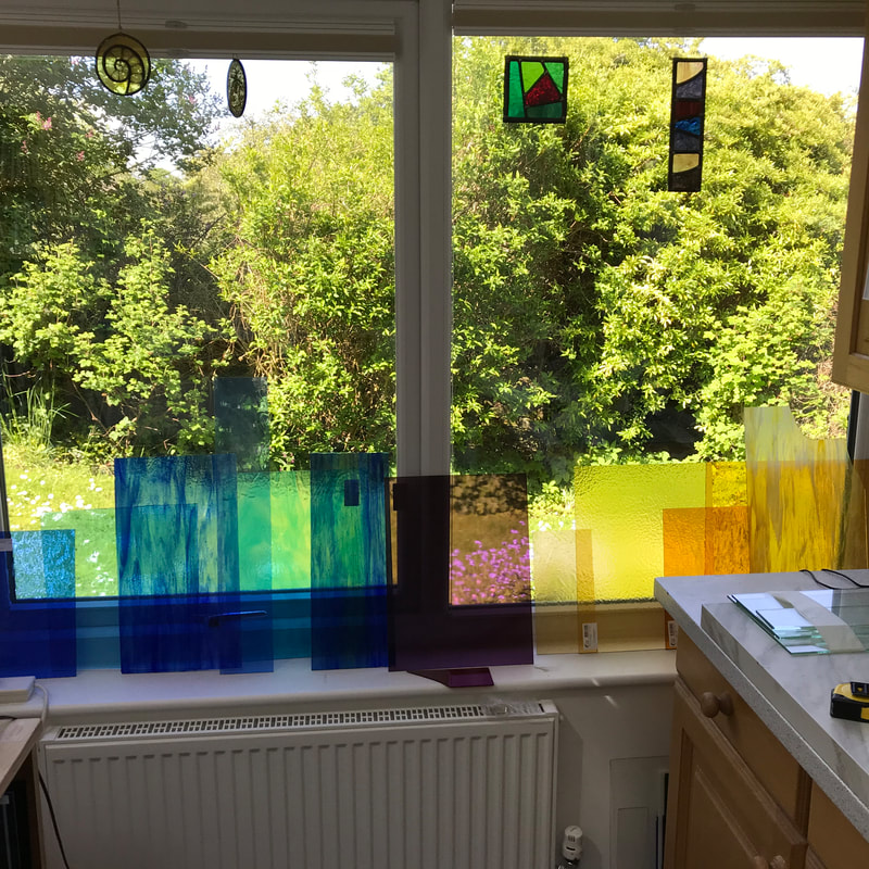 I was able to show Judith some designs and a selection of glass and below is the chosen design, with instructions from Judith not to make her look as if she is wearing a 'tankini'! The sky, with its radiating lines, seems slightly art deco, which suits the house. It was built in the 1930's in Florence Park, Oxford, for workers at Morris Motors in Cowley. 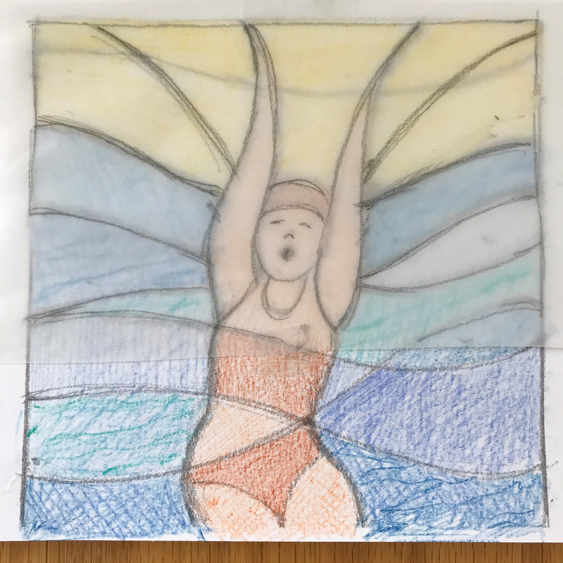 Now I can move on to cutting the glass and starting the making process - I will keep you posted!
If you are interested in the poetry book, please take a look here.
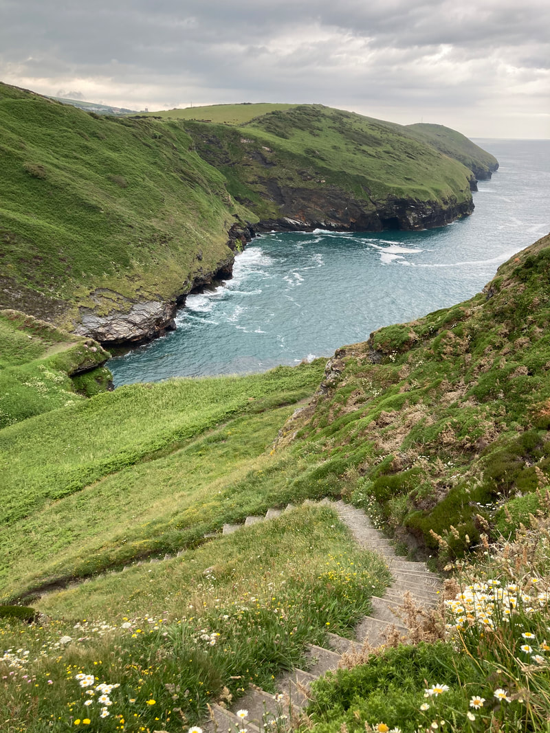
A walk on the first evening of our holiday near Boscastle in North Cornwall brought an unexpected bitter sweet waft of Thomas Hardy, who is of course normally associated with Dorset. As we ascended a steep valley, there were the four pinnacles of the square tower of St Juliot Church peeping above the windswept hedges.
On entering it struck me as a (disappointingly) Victorian interior, but clearly there among the plain windows was something special: a memorial window for Thomas Hardy, full of delicate engraving by Simon Whistler. The window celebrates Hardy's association with the area of Cornwall he came to in 1870 as a young architect sent to oversee the restoration of the ruined church of St Juliots. Architecturally, it is a ‘heavy’ resporation as so little of the ancient building could be reused that only birds and bats were enjoying it. For Hardy it was a deeply significant period of his life as the Rector’s daughter in law (and keen champion of the project) was Emma Gifford. Emma was to become his wife, and it was she who encouraged him to turn away from his architectural career and devote himself to his true vocation as a writer.
Whistler's sensitive imagery is full of the local landscape and references to the story of their courtship, including Emma on horseback on Beeny Cliff, with her hair flying in the wind.
Hardy drew on his experiences of the restoration of the church and meeting Emma in his novel, ‘A Pair of Blue Eyes’, and after her death, he published his poems of 1912-13, looking back at that time with love and regret. 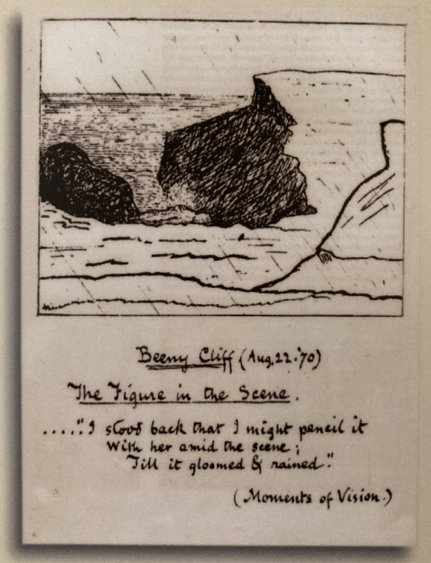
Click to set custom HTML
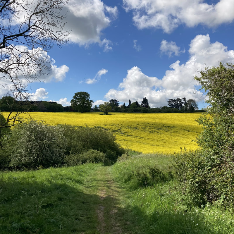
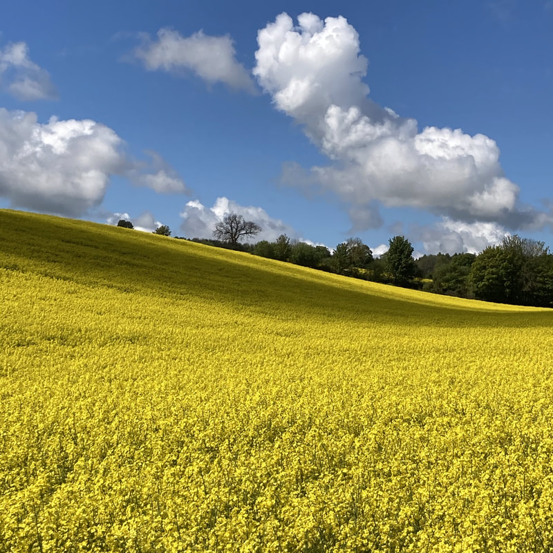
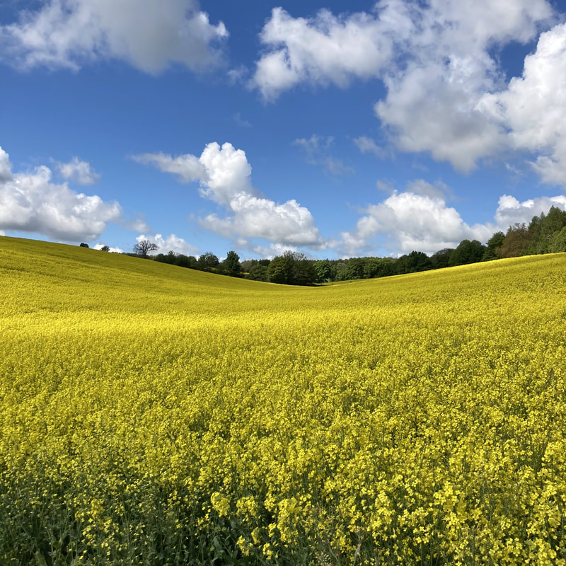
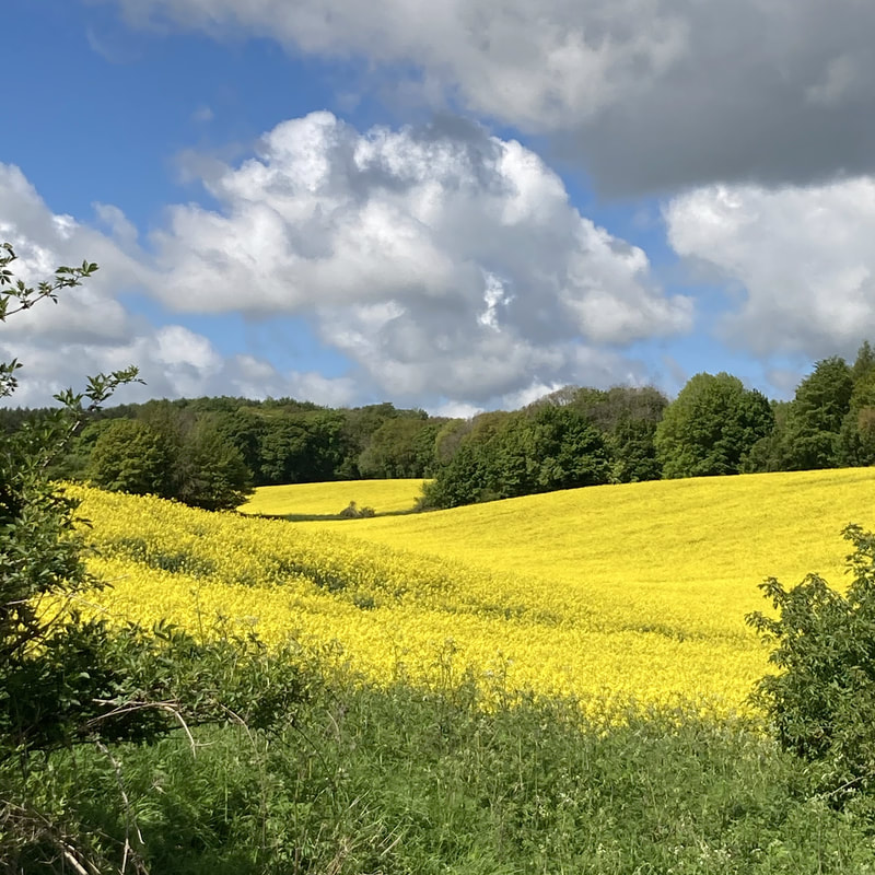
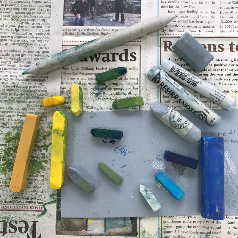
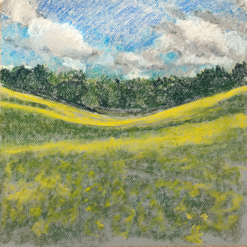
Walking from Cornbury towards Finstock, past the bull field, one fine day in May, I was faced with a sea of yellow oil seed rape. I love the little bowl-shape valley there and that day there was fast moving shower cloud, casting shadows moving across the field. Thinking about it over the next few days, and looking at my photographs, I wanted to recreate not only the intensity of the colour, but the sense of space both across the land and across the sky, with clouds blowing towards and above me. I haven't used pastels in a long time, but knowing I wanted real intensity of colour, I got out some oil pastels and made a quick sketch, seeing what marks I could make, and whether I could work in layers, colour above colour. 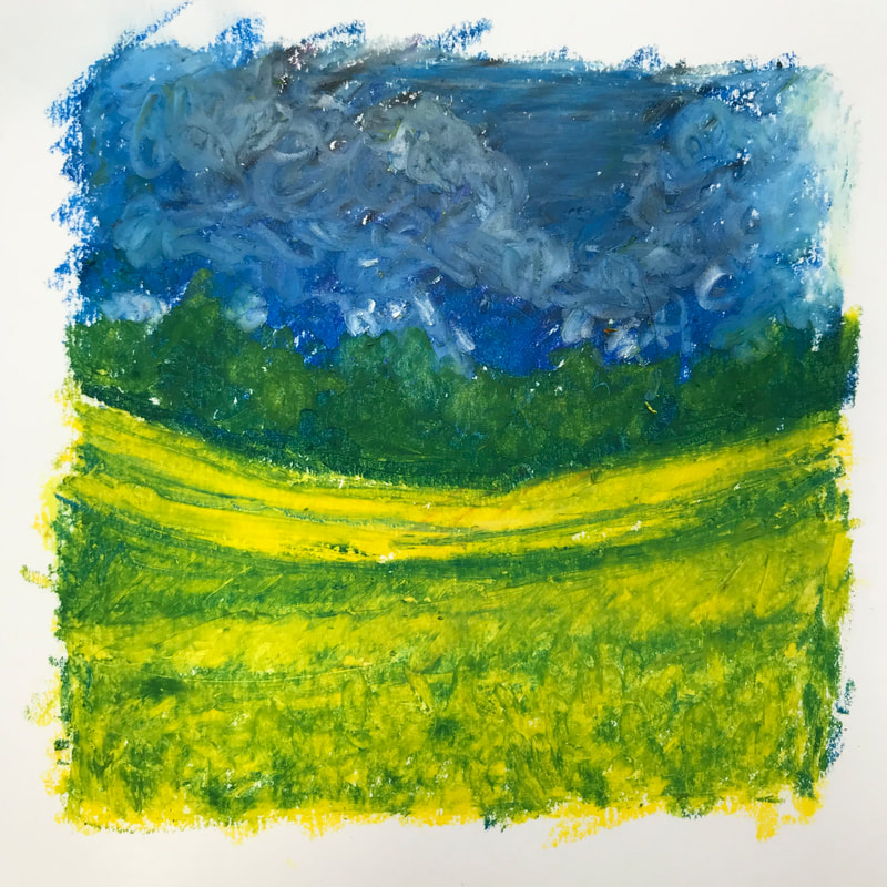 Encouraged, I went on to make a small, more finished drawing on pastel paper. As I worked I realised the yellow sits in a sea of green. I wanted to use a variety textures - blending in areas more blurred in the distance and using lively curly marks in the foreground. 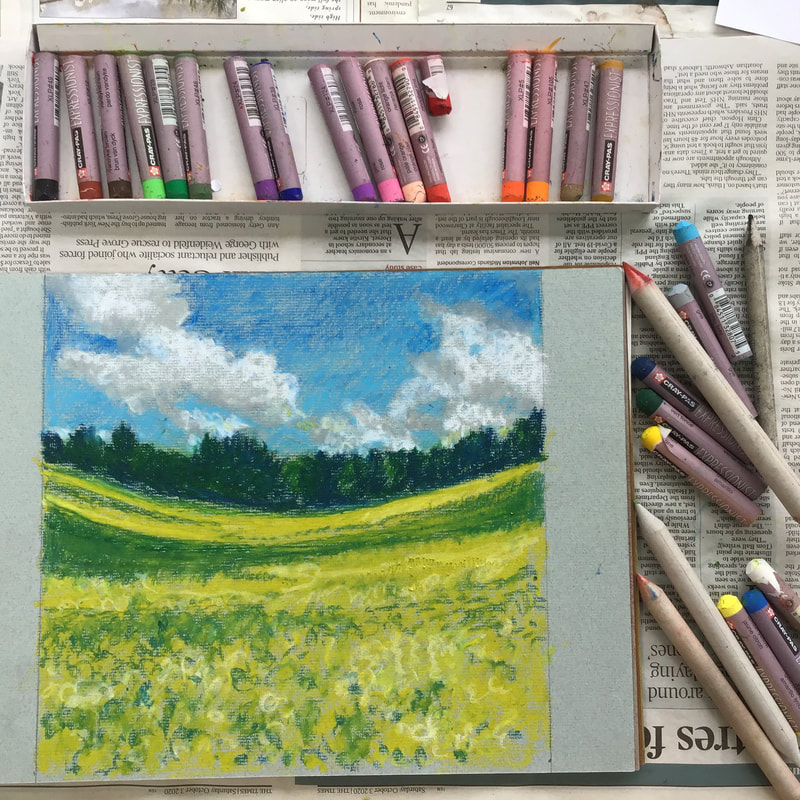 Having recently had some rather frustrating struggles with acrylic paint, I found I was really enjoying using pastels, which I see as working with colour in stick form - in effect, drawing with colour. As a drawer, I am happy with some kind of mark-maker in my hand! When it comes to paint, I enjoy using watercolour and inks, but watercolour is not what you need for building up a picture in layers - it seems to me watercolour is all about capturing translucency and fleetingness, not solidity. I decided to be bold and go big, this time working in chalk pastels, which are crumbly and can be used broadly in big sweeps, or finely. I have a good collection - one box of Sakura pastels goes right back to my childhood. I found a large sheet of Canson pastel paper in a greenish grey, and set to work, remembering to stop work and step back from the work to see what is really going on! 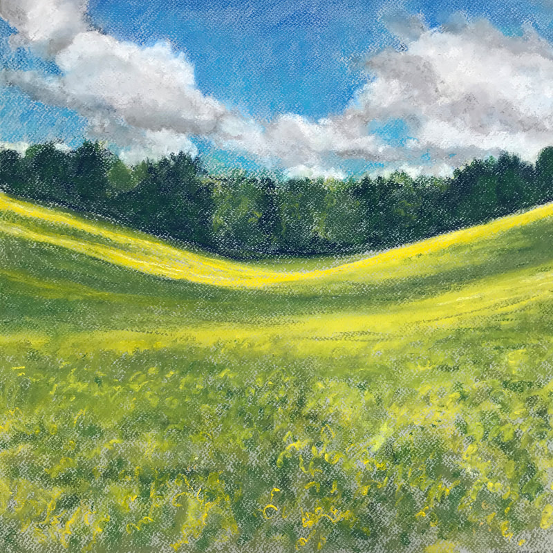 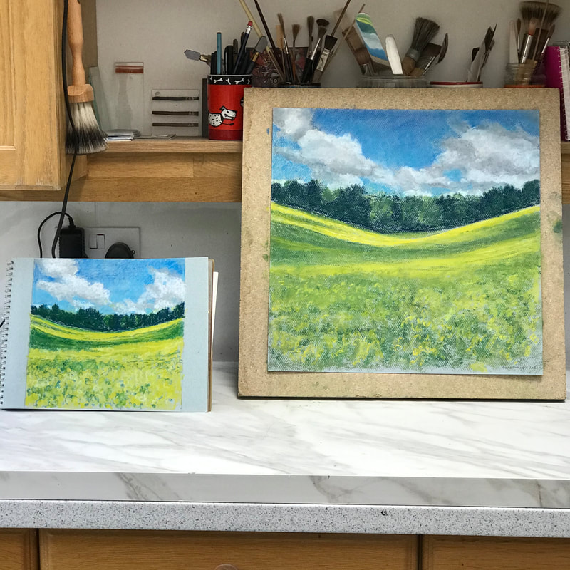 I enjoyed my few days immersed in that field (I even dreamt about it) and I feel I have captured something of the glow of that morning. I might even mount the final piece. But now I shall turn back to making stained glass refreshed, and ready for the next design.
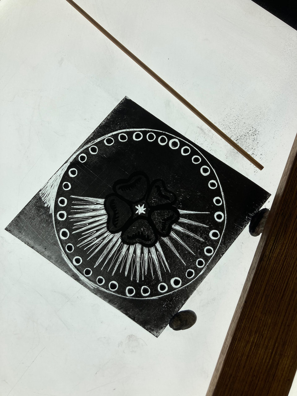
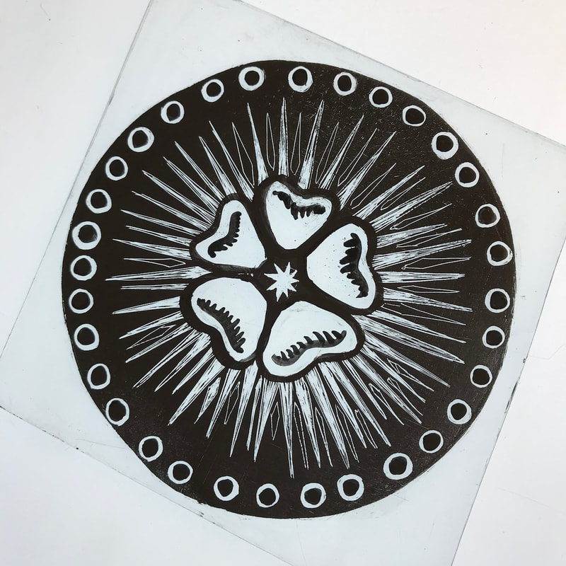
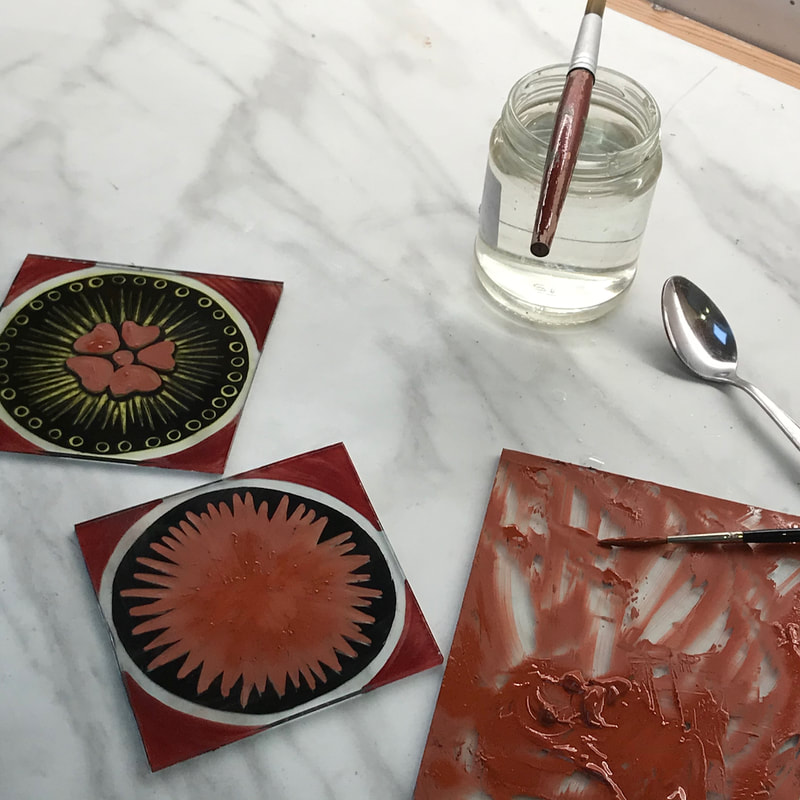
I have been making good progress on my circular window. Here is a little slideshow. Now that the panel is dry, I have delivered it to Teresa and Richard and I await the opportunity to see it in situ and lit up.
|
AuthorI am a glass artist based in Charlbury, Oxfordshire. I work in stained and fused glass. I work to commission and teach stained glass in my studio. I open my studio to visitors during Oxfordshire Artweeks. Archives
July 2023
CategoriesStay in touchTo follow my blog in your favourite browser please click on the RSS Feed button below. You can find me on social media or just subscribe
to my newsletter. |


 RSS Feed